Turning Brastemp's generic product page into a premium buying journey
A redesign shaped by award-winning benchmarks and behavioral data, rebuilt inside a new design system on a launch deadline that would not move.
Case at a glance
Role
Senior Product Designer (lead)
Company
Whirlpool / Brastemp
Timeline
4 months
Tools
Figma, Figma Make, GA4
Teams
Product squad (mine)
Design Ops
Content
Data
UX Research
Insurance & Services
Whirlpool leadership
Constraints
Fixed launch date
Mid-migration to Orbit
No styled photography or per-feature video
Context
Brastemp's new premium refrigerators sat on a generic product page. Value went unperceived, sales leaned on discounts, and leadership had named the redesign one of the company's top 10 initiatives.
Challenge
Lift conversion on a high-ticket product and give the page a bespoke, aspirational, premium feel worthy of the new positioning. All on a fixed launch timeline, mid-migration to a new design system, and with hundreds of possible directions to choose from.
My direct contribution
I led it end to end: the discovery (competitor benchmark, behavioral data, CES survey), the redesign from generic catalog to a real buying journey, and a high-fidelity prototype built on the new design system's tokens and components. I coordinated my product squad and partnered with Design Ops, Content, and Data. My hardest call was defending, with the Insurance & Services team, that the page should secure the product's conversion before selling the add-on.
Impact
Add-to-cart nearly doubled when the content stopped hiding behind a click.
Also new: the structure was shipped as a reusable blueprint for every premium product launch that follows it.
01 · Challenge and context
One of the company's top 10 initiatives
Mad Max was Brastemp's move to reposition the brand into aspirational territory, alongside the launch of its premium appliance line. Leadership defined it as one of the company's top 10 initiatives, in their own words:
We want to recreate our Product and Category pages with more immersive and interactive content and communication, simplifying the way we present our products.
The transformation compass. The first time Brastemp measured its own content against consumer studies, and what it committed to in return.
AS-IS
TO-BE
Technical barrier: complex features, value not perceived
Assertive communication: spotlight on differentiators and features
Reliance on incentives: selling on discount, coupon, shipping
Modules you navigate by angle or feature, where the user investigates rather than scrolls past.
05Nothing, Apple
Design equals identity
The product’s visual language dominates the whole digital experience.
06Bellroy, BORA
Interactive proof over claims
Value shown with visual tools and short video, not just text.
Five of the benchmarked pages, scrolled side by side: Ōura, Bellroy, BORA, Apple, and Nothing.
During this stage I also mapped the dependency that worried me most: our graphic materials were simple next to the competitors'. Without premium photography and per-feature video, scroll storytelling had nothing to fill the screen. That became a work stream of its own.
A UX critique of the current product page then confirmed, from the UX side, exactly what the kickoff had flagged from the business side: static content, value not perceived, over-reliance on incentives.
What's missing to reach the next level: Bespoke Aspirational
Per-feature video, mobile-first and desktop, in use
Photos without a fullscreen / zoom modal
Pop-up banner at the wrong moment, interrupting the journey
To improve4
Premium visual design of the page
Product description, highlights and microcopy
Differentiators and features carousel
Technical information / spec sheet
Two of those critical gaps were not mine to fix on a screen. The line launched with just 2 SKUs, small enough to produce the missing photography and video by hand, but more launches were coming, so I did not solve for two. I gave the content team a production guideline built to serve every future launch, and defended the budget for a new image set by arguing its reuse across inbound and outbound.
03 · Data analysis and problem space
Which modules actually move someone toward the purchase?
The benchmark opened more directions than one page could hold. Crossing them against how the current page actually behaved is what turned a list of possibilities into where to act, what to change, and why.
Three sources, none of them answering the same question:
GA4. What people did on the page, module by module.
Hotjar. How they did it: where they stalled, what they scrolled past, what they never reached at all.
CES survey. What they said about it afterwards.
I ran the behavioural cuts with the Data team, and built the personas with our UX Researcher from the two together.
Non-buyer
The Window Shopper
I’m just having a look. If the page doesn’t show me what I want right away, I close the tab and I’m gone.
Share of traffic
66.7–69.7%
Reaches 25% scroll
~59%
PDPs per session
2.04
Impact on design
Hook, don’t close.
Rarely buys on the first visit, so the job is not the sale: it is an impression strong enough to anchor value for the next one, and enough pull to keep the scroll going.
Buyer
The Pragmatic Validator
I want to buy, but I’m not impulsive. I need to know it fits my space, that the math on shipping and installments works, and that other people trusted it.
Share of traffic
up to 16%
Conversion at 4+ features
16.22%
PDPs before deciding
4.30
Impact on design
Answer the basics, then sell the features.
Colour, dimensions and the cost of ownership settle first. Only then do the killer features land, and they land better shown than described.
CES · Customer Effort Score
Two themes carried 83.6% of the complaints, at 41.8% each. Together they describe one problem: the old page asked too much effort, first to find the truth, then to get past the noise.
Hidden or missing technical information
41.8%of all complaints
32.5%Could not find technical information
5.8%Did not understand the features or differentiators
2.3%Photos did not help picture the product
1.2%Other people's reviews did not help
Information like the height should be at the top. Hunting for it is exhausting, I’ll give up.
Impact on design
Make technical information easy to find.
It produced two modules: a dimensions view for the objection, and the Product Tour for the features nobody was reading.
Visual clutter: pop-ups and text overload
41.8%of all complaints
32.5%“None of the above”, where the open comments piled up: bugs, pop-ups that would not close, a hidden buy button
9.3%The site was slow to load
Too many pop-ups in your face in front of what you want to see, and you just give up.
Impact on design
Strip the clutter before adding anything.
The dense add-on block moves out of the first fold, which turned out to be the hardest call in the project.
Lift by module
Lift is not conversion rate. It is how much more buyers use a module than non-buyers.
ModuleLiftDepends onWhat it meant for the redesign
Differentiators+100%Content + designThe only content that doubles buyers' engagement. The real bespoke opportunity.
Reviews+65%Content (system)Positive but moderate. Reused from Orbit, no new build.
Description+20%ContentMatters more on mobile.
Browsing · negative liftWhere browsers linger before leaving.
Image gallery‒31.65%Content + designThe symptom was the old gallery, not images. Redesigned for the two jobs.
Similar products‒36%ComparisonBrowsing, not buying.
High lift isn't the target. The opportunity is where design can create value, not just capture it.
Each one settled a different question:
The personas settled engagement opportunities. The same funnel carries someone who will not click and someone who will not commit without proof, and a page that picks one of them loses the other.
The CES settled friction and pain points. Effort, in two forms: hunting for the truth, then getting past the noise. Both are the page's fault, and both are fixable.
The lift settled where to focus our effort. Not on the highest scores, which only record decisions already made, but on the differentiators, the one module where content creates value instead of capturing it.
That left me with hypotheses rather than convictions, which is the point: make the basics findable and the Validator stops leaving to search for them; expose the differentiators instead of hiding them behind a click and the Window Shopper goes deeper; move the add-on behind the decision and the product's own conversion rises without the attach collapsing. Wave 1 tested the cheapest of the three before anyone spent a sprint on the others.
04 · Wave 1 · quick win on the current product page
Validate the direction cheaply, before investing heavily
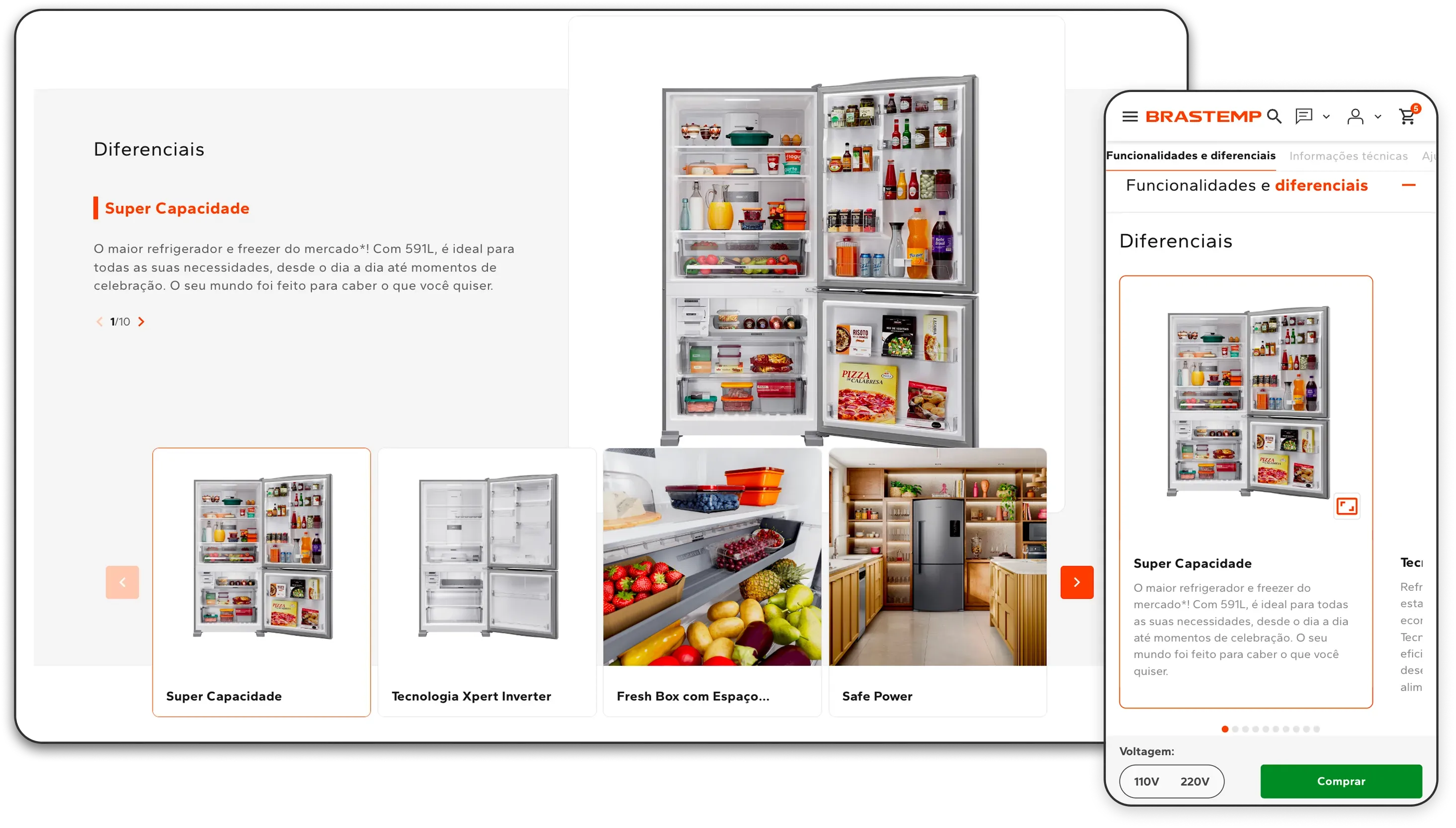
The launch dates would not wait for the Orbit roadmap, so I validated the direction on the old site first. The central move was a new differentiators module: collapsed, click-to-open sections swapped for open ones in an alternating image-and-text sequence, in vibrant marsala. The bet was simple: expose the content the data called high value, instead of hiding it.
BeforeAfter
05 · Wave 2 · full redesign in Orbit
Where to invest, where to reuse
Before the A/B test even closed, the job shifted: v2 was the whole page rebuilt inside Orbit, a reusable blueprint rather than a one-off screen. Orbit lived in Storybook as a library of components, so I composed each module inside its logic, reusing agnostic components where their quality held and building from tokens, atoms, and molecules where it did not, negotiating with Design Ops which parts they would ship and which were mine. My rule for spending: new-build budget only where impact was high and nothing existing solved it. Everything else, recompose or reuse.
Every module as a cost decision: impact on conversion against build effort
New build (high effort)Recomposition (medium)Reuse / light redesign (low)
Impact on conversion →
High leverageBig betTable stakesAvoid
Product Tour
First fold
Dimensions & manuals
Relocated cross-sell
Rebuilt reviews
FAQ & alternatives
Build effort →
I documented each decision as a test card: we believe that… / to do this we will… / we will know we were right if…
Module
Build
We believe that…
…we were right if
First fold: expanded gallery + anchors
Recomposition
the #1 CES pain (validating the basics) blocks the purchase
internal search for dimensions drops and qualified scroll rises
Dimensions & manuals toggle + exploded view
Recomposition
the fear of "it won’t fit" is a silent objection
post-purchase questions and returns by dimension drop
Relocated cross-sell (warranties/installation)
Recomposition
the attach happens better post-decision
product conversion rises without a proportional drop in attach
Rebuilt reviews
Reuse
social proof (+65%) supports the Validator
engagement rises and scroll reaches the module
FAQ and nearby alternatives
Reuse
residual objections stall the final step
abandonment from unanswered questions drops
Product Tour
New build (big bet)
it is the only module that attacks the inertia (detractor #1)
the Window Shopper interacts and findability of technologies rises
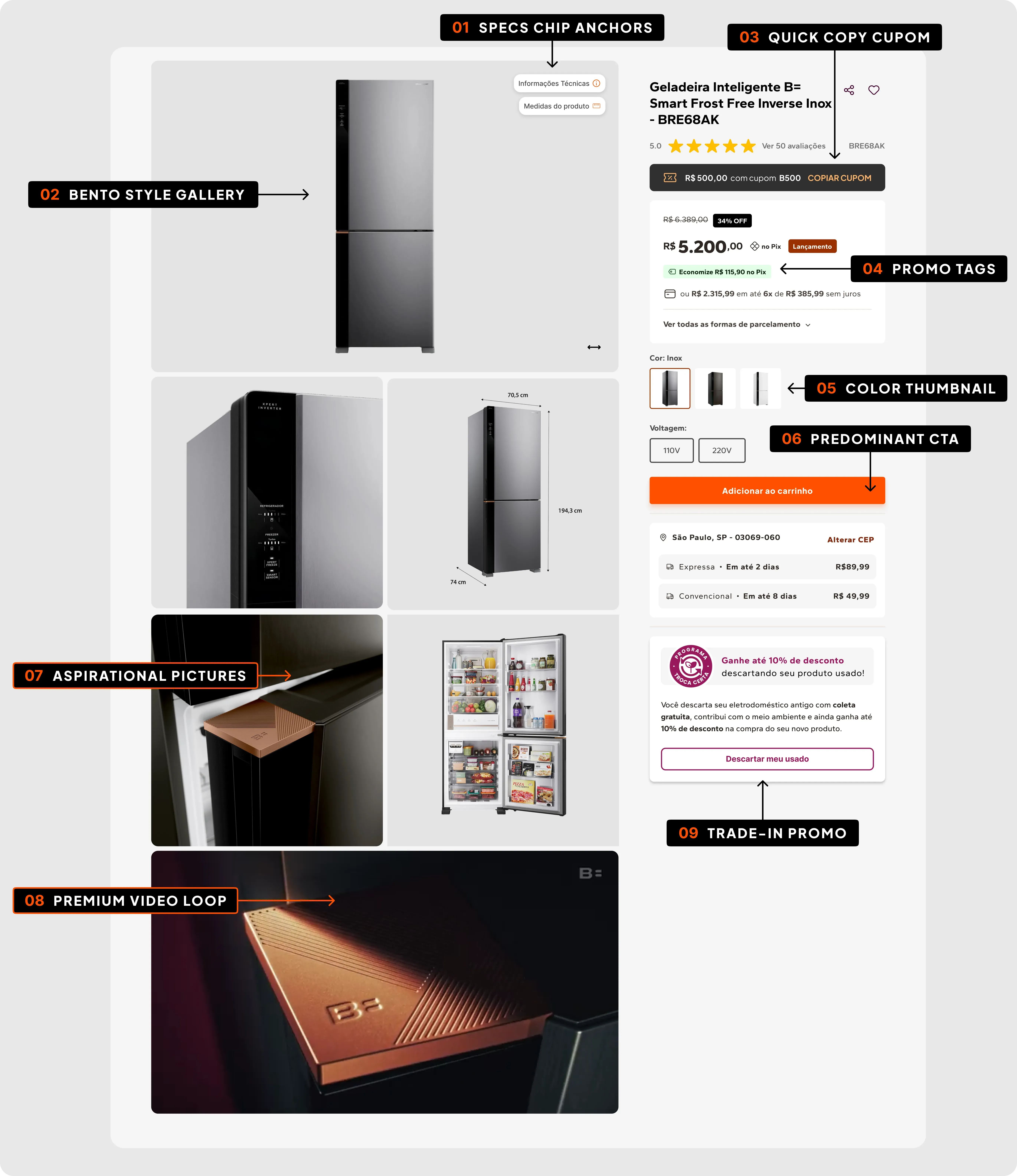
The new first fold redesigned
For the Window Shopper, hook, not close. Expanded premium photos and a looping video build desire. Scroll depth rose 51%, and readers who pass 50% of the page convert about 45% above average.
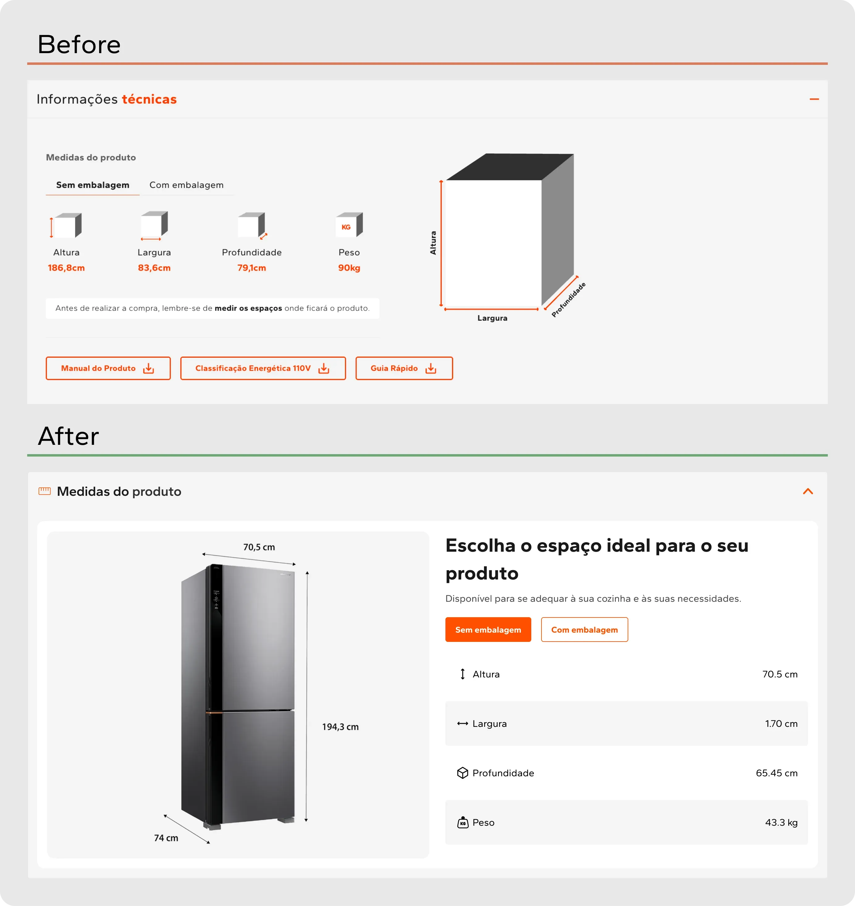
For the Validator, resolve objections, fast. A dimensions photo and anchor chips jump straight to the specs and the modules that follow.
The redesigned gallery: expanded premium photos and a looping video at the end. Desktop and mobile.Dimensions, answering the silent "it won't fit" objection.
Reused, not rebuilt
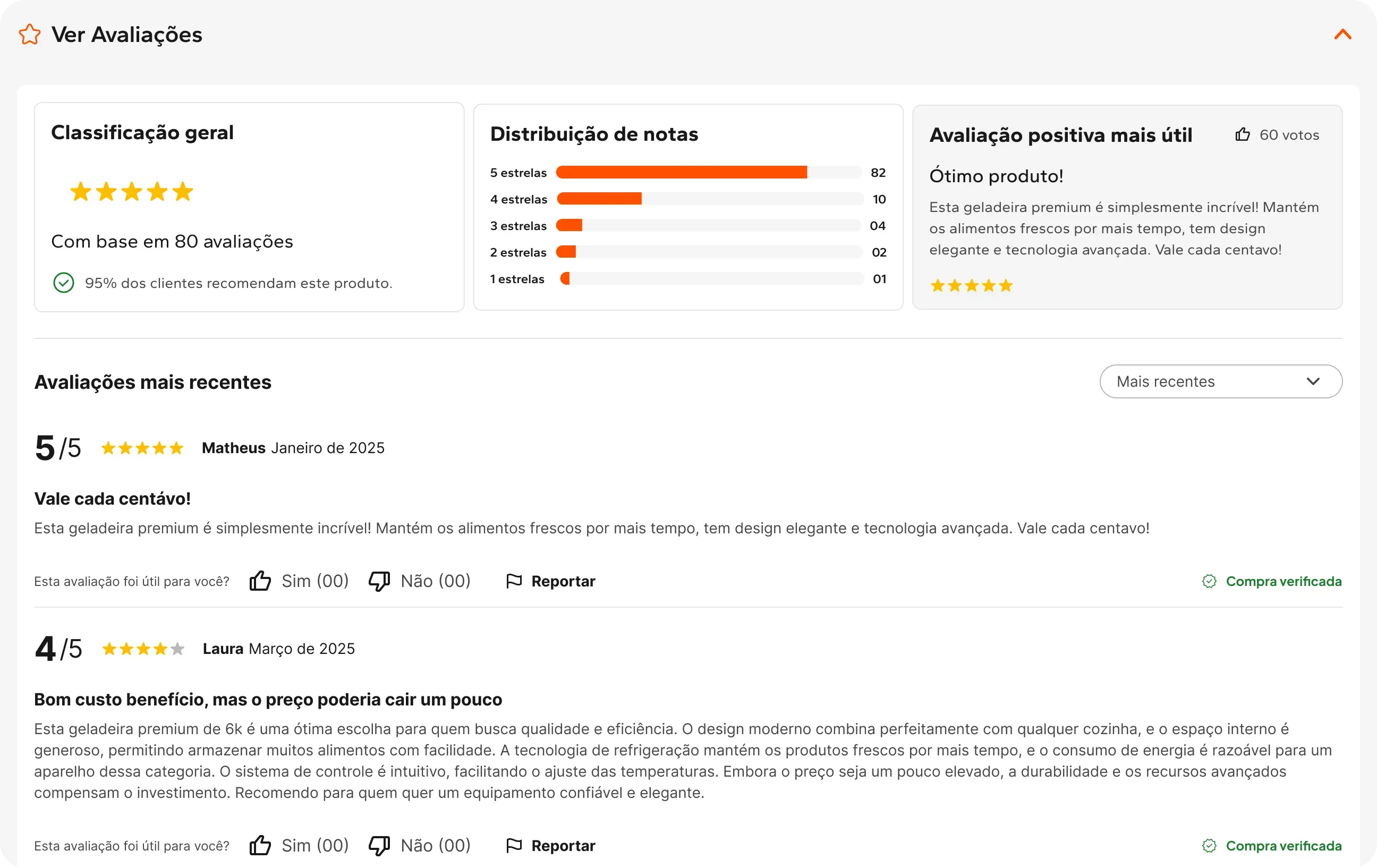
The old reviews block was legacy VTEX. Instead of designing a new one, I reused the component Orbit had already shipped for Whirlpool Colombia's launch: aggregate rating, score distribution, filters, and verified purchase, all inherited. The lift was positive but moderate (+65%), so it didn't earn a new build. It earned good reuse.
Reviews, reused from Orbit: aggregate rating, distribution, verified purchase.
The remaining modules followed the same logic. FAQ and nearby alternatives were anchored in the real objections: voltage, installation, warranty. The cross-sell relocation was specified and never shipped, which is the subject of the last section.
The showpiece
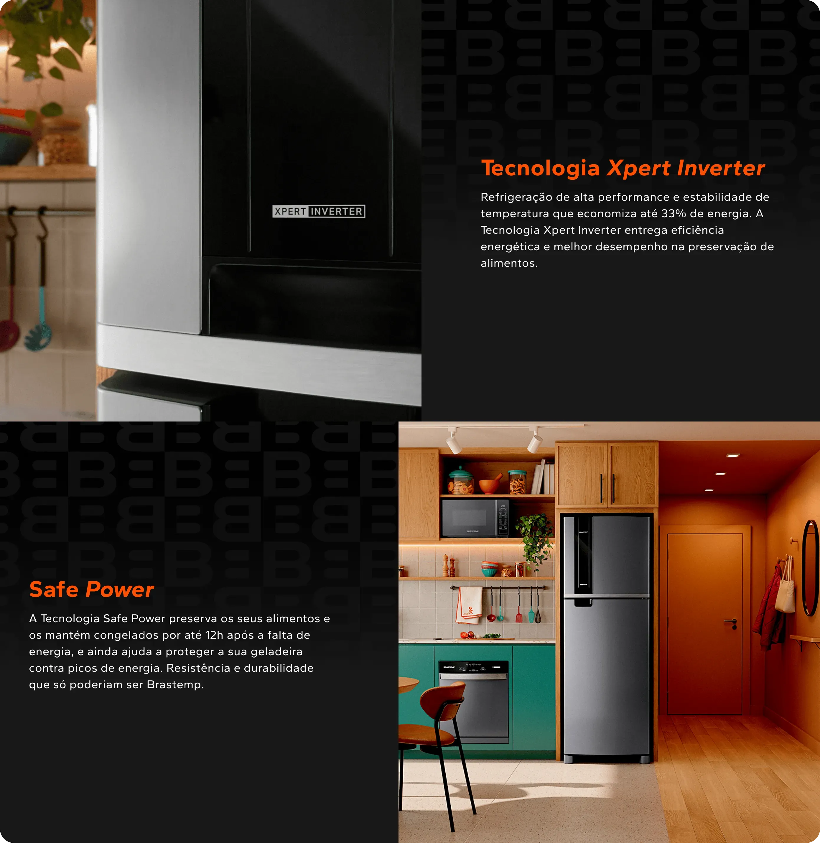
Product Tour
A styled kitchen with the refrigerator at the center, navigation by feature, and a layered feel that puts the user inside the scene. My most deliberate call was an automatic timer, 5 seconds per feature, so each technology presents itself without a click.
It answers the number-one CES pain. Hunting for technical information. The timer presents each feature without asking for a click.
One module, two jobs. It carries the Window Shopper through features they would never have clicked, which buys depth. It is a showroom for the Validator, who can ignore the timer and take each feature apart at their own pace.
Product Tour: feature navigation with a 5-second auto-timer.
06 · Trade-offs
What I gave up, and what I bought with it
Reuse before craft.Gave up A reviews module designed for this page.Bought The squad capacity that went into building the Product Tour.De-risked by Taking the component Orbit had already shipped for Whirlpool Colombia. Aggregate rating, score distribution, filters and verified purchase, all inherited, all already running in production.
The launch date before complete content.Gave up Per-feature video, moved to a later version.Bought Shipping on a date the brand's anniversary had already fixed.De-risked by Prioritising modules that already fit Orbit, so what is missing is a wow gap rather than a conversion gap.
The evidence I had before the evidence I wanted.Gave up A moderated usability test.Bought Weeks, and a live A/B instead.De-risked by Moving only where the behavioural data and the benchmark pointed the same way.
07 · Results and what we still need to measure
What the cheap test returned
These are Wave 1's numbers, measured on the old site during the launch period: the differentiators module de-collapsed, its content exposed instead of hidden behind a click, against the version that still hid it. The rebuilt page in Orbit is not in them.
Wave 1 as it ran, live on the old site: the differentiators module de-collapsed, its content exposed block by block instead of hidden behind a click. This is the version the numbers below were measured on.
The result
10.65%
Add-to-cart from 5.97%
+63%
Final conversion
How it got there
−45%
Bounce rate
+47%
Engagement time
+51%
Scroll depth 75% band · readers past 50% convert ~45% above average
+78%
Mobile conversion
Honesty about causation
The gains do not come from the layout alone. Parallel initiatives, such as Project Themis (tracking accuracy) and the Complementary Feed (qualified traffic via regional offers), were fundamental levers. The cleanest causal reading comes from a category where price was neutral and the decollapsed layout still beat the average. That is the argument I stand behind without caveats.
What we still need to measure. Wave 1 proved that exposing the content was worth doing, which is what justified building the rest. What it cannot say is what the rebuilt page is worth. The full v2 in Orbit has not closed, and that figure will follow here when it does.
08 · Reflection and next steps
The gap I did not close
Moving Insurance & Services out of the first fold was my hardest call, and I treated it as a decision about a page. It was a decision about an organisation. Warranties, installation, trade-in and parts belong to other teams with their own targets, and a display strategy that settles where they live has to be built with those teams, not defended against them. I made the case from both sides, the behavioural data and the CES, and designed the move as a controlled test on a single SKU so that nobody had to take it on faith. It never ran. Those teams were absorbed by the platform migration and the capacity was not there for this front, so the module is still in the first fold and the proposal is still a proposal. That gap is the thing standing between this page and the branded journey it was meant to become.
It also helps to be exact about how far this went. On the maturity ladder I use for premium pages, the page shipped at stage three of five.
How far a premium product page can go, and where this one stopped.
1Standard PDPStatic content, 21 loose images, a carousel nobody opened.
2V0 · Quick winsExisting assets, resequenced into a narrative.
4V2 · Scroll storytellingDedicated video per feature, desktop and mobile.
5Bespoke branded journeyA crafted page per launch.
Reaching stage three on 100% existing assets was a choice, made to fit a launch date that would not move. Stages four and five do not need more design. They need content produced alongside the product.
So I took it to the PM and the managers as a production problem rather than a design one, with two proposals. Every launch ships two cuts of each feature video: one with burned-in text for social, and one clean, usable in a product page, a landing page or the catalogue. And one track from launch kickoff to live, where design, content and marketing agree the asset matrix per feature up front, instead of each channel commissioning its own. The production already happens. It is just fragmented, so the model reorganises it rather than adding to it.