The shopping-journey redesign behind R$296M in new revenue
How do you fix a journey that's leaking at every step, without just piling more onto the page? Five drop-off points, five targeted moves (grounded in analytics, heatmaps, benchmarking, and A/B testing) lifted conversion +27% YoY at a 112% ROI.
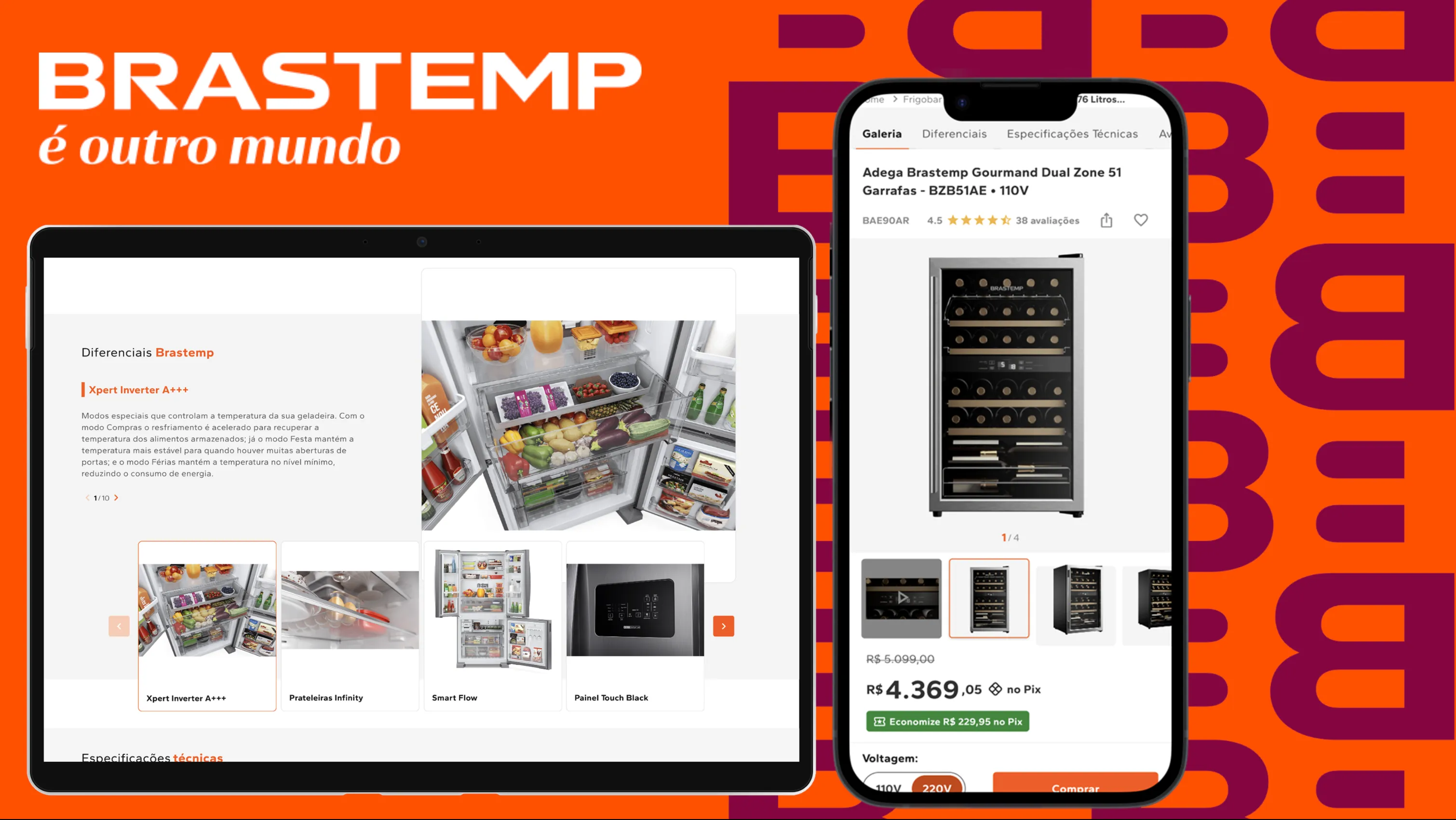
Case at a glance
- Product squad (mine)
- Analytics & Data
- VTEX engineering
- Content
- PM & PO
Across Q3, Brastemp's e-commerce saw revenue slide. My product team was handed one mission: analyze the entire shopping journey and pinpoint the highest-impact opportunities to lift conversion.
The funnel was leaking at every step, from category pages to checkout. Diagnose why on a technically constrained VTEX platform, and move the numbers without heavy interaction patterns that would trade performance for polish.
I led it end to end: the discovery (analytics, heatmaps, a CES survey, and a competitor benchmark against Baymard guidelines), the problem framing, the redesign of four product-page pain points plus checkout, and A/B validation. I coordinated my product squad and partnered with Analytics, VTEX engineering, and Content.
The journey stopped leaking and started converting.
Funnel-wide over the period; individual modules were isolated and A/B-validated.
A funnel leaking at every step
By Q3, the dashboards were telling a story nobody wanted to read: revenue was sliding, with no single reason to point to. That ambiguity was the assignment. Rather than guess, I set out to find where the money was actually leaking.
Working with the analytics team, I walked the funnel step by step. The drop-off wasn't isolated to one page; it compounded across a handful of core touchpoints, product category pages, the product page itself, the add-to-cart action, and the cart-to-checkout flow, each one shedding a little more intent than the last.
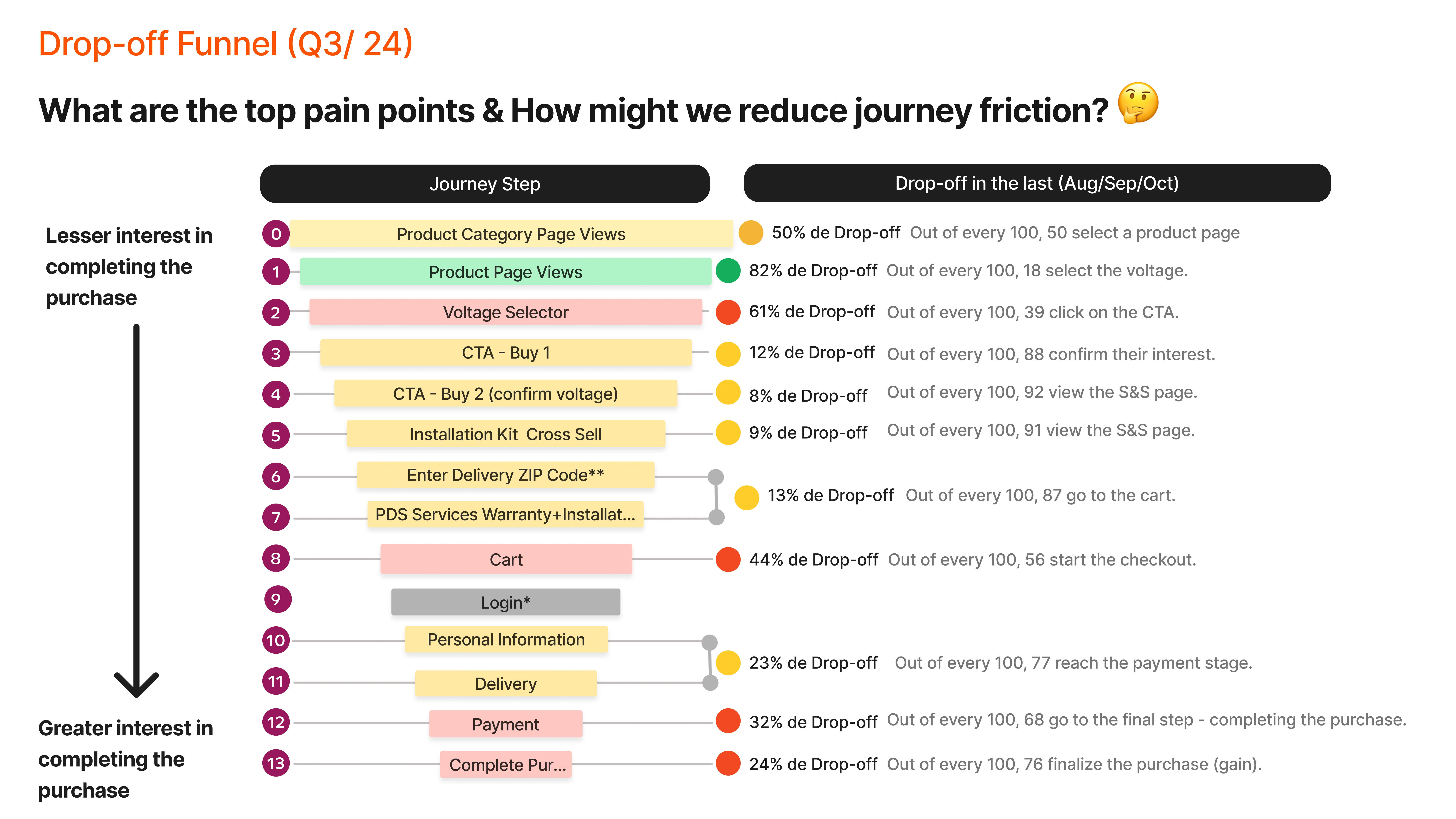
A drop-off chart shows where, not why
A drop-off chart tells you where people leave, never why. Knowing the funnel bled hardest at the product page was a starting point, not an answer, so I went looking for the behaviour behind the numbers. My next move was to bring in Hotjar and, alongside the CRO team, analyze the conversion data module by module across the product page, measuring how much each section actually pulled its weight toward a purchase.
To separate signal from noise, I triangulated three sources.
1. Attention was pooling in the wrong places. Heatmaps plus a Customer Effort survey showed interaction clustering tightly on the product title, price, and Buy button, confirming those as the real decision-making zones, while the gallery, specs, and reviews got far less attention despite mattering to the purchase. On mobile, price and CTA weren't even visible on landing, which raised effort before a decision could start.
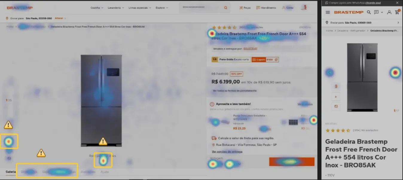
I couldn't find the Buy button right away, I had to scroll to even know where to click.
Research participantThere's too much clutter and confusing prices before the important info.
Research participant2. The content that drove purchase wasn't the content people could reach. A behavioral analysis of which sections most influenced purchase surfaced a clear mismatch. The Buy CTA (93.9%) and product characteristics (87.4%) were top drivers and sat above the fold, but User Reviews (57.5%) sat well below it, and specs were buried deeper still.
How much each product-page section engaged shoppers before they bought
| Product page section | CTR before purchase | Above the fold? |
|---|---|---|
| Buy CTA | 93.9% | Yes |
| Product characteristics | 87.4% | Yes |
| User reviews | 57.5% | No |
| Image gallery | 45.0% | Yes |
| Product specs | 39.9% | No |
| Shipping calculator | 25.8% | Yes |
| Coupon code | 22.0% | Yes |
| Cross-sell services | 17.0% | No |
| You may also like | 15.9% | No |
| Product menu | 11.2% | Yes |
| Color selector | 10.0% | Yes |
| Technical support | 8.1% | No |
What "CTR before purchase" means here: the share of shoppers who interacted with a given section on their way to completing a purchase. A high number means the section earns attention on the path to buy; a low number means people rarely reach or engage with it, no matter how much it may matter to the decision.
3. The reframe lived in one relationship. Plotting each module by scroll-engagement against conversion-impact made the core opportunity impossible to miss: User Reviews had high conversion impact but low engagement, because they were buried too deep. People who reached the reviews were far more likely to convert, so the reviews needed to come up to meet attention, not wait for it.
Move intent to where attention already lives
My main insight from the data was that the elements with the highest influence on purchase,reviews, trust signals, the CTA, and clear pricing, were exactly the ones users had to work hardest to reach.
The reframe
The redesign's job wasn't to add more. It was to take the modules with the greatest impact on revenue, the ones that actually drove conversion, and bring them up to the top of the page, where attention already lived.
To make that concrete, I mapped the whole product page into four engagement zones, from where attention peaked at the top to where it flatlined at the bottom. People scrolled roughly 60% deeper on mobile, but the shape held: the revenue-driving modules had to move up.
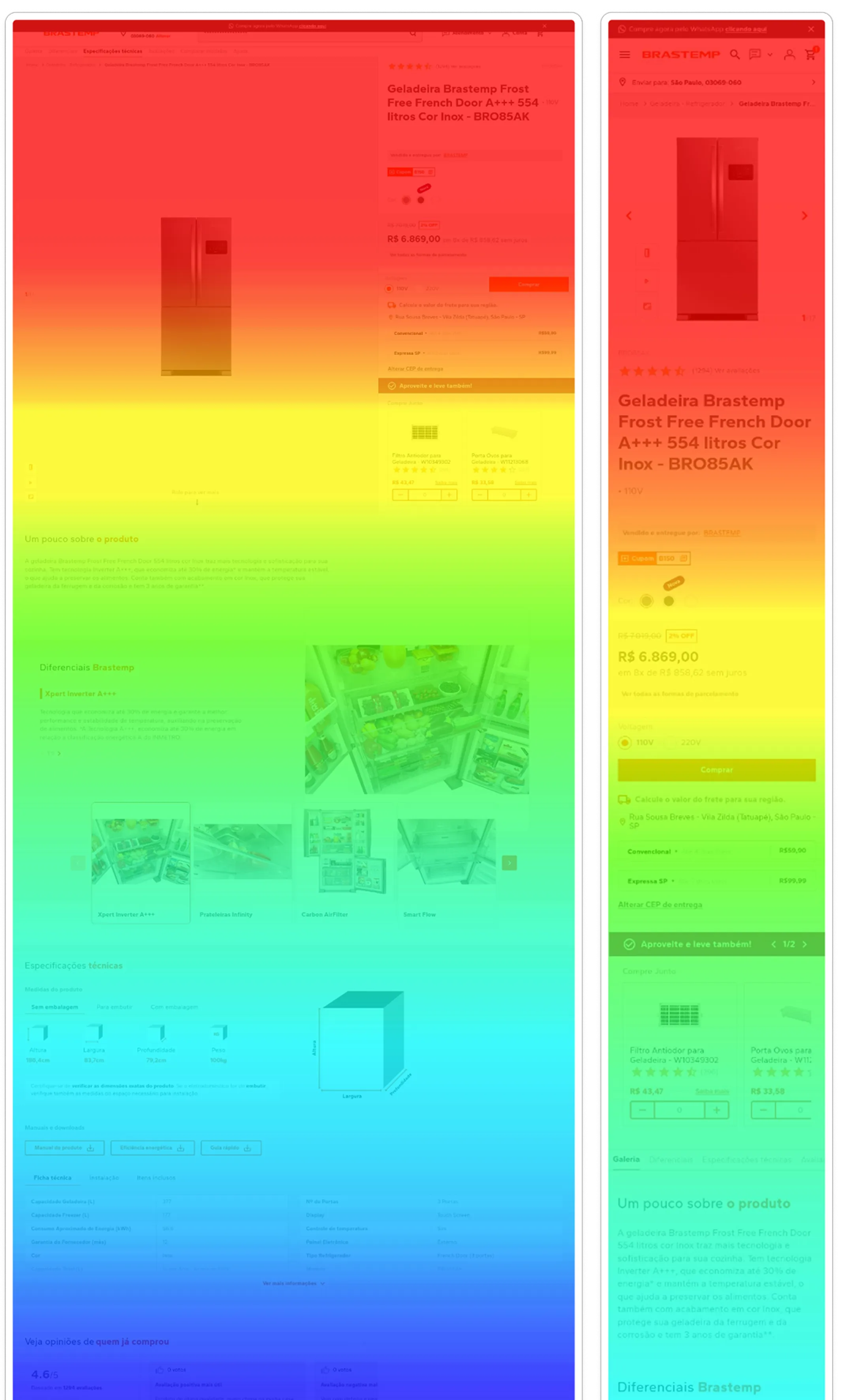
High engagement
- Product first view, table of contents, image & gallery
Mid engagement
- Product description
- Product special features
- Product specs
Low engagement
- User reviews and product rating
Dead areas
- Cross-sell, “you may also like”
- Product comparison
To turn the diagnosis into design decisions, I plotted every product-page module by how much users engaged with it against how much it influenced conversion. Two areas of the chart told me exactly where to act.
- High engagement
- Mid engagement
- Low engagement
- Dead area
The amber zone was the headline opportunity. User reviews (buyer_opinions) drew one of the highest interaction-versus-conversion ratios on the entire page: shoppers who buy actively seek them out. Yet the module sat buried at the very bottom, far below where that intent lived. Moving it up and redesigning it was the single highest-leverage move the data pointed to.
The green zone was a cluster worth compounding. These modules already share the first and second fold, exactly where attention concentrates, so they earned high engagement but were still converting below their potential. Because they sit grouped in the same stretch of page, they could be redesigned together to pull more weight, rather than competing for attention that wasn't there.
The constraint I designed around. Given the technical limits of the VTEX platform, I deliberately chose UI solutions that could deliver high impact while staying lightweight, which also served an internal KPI: Core Web Vitals and loading speed. I passed on heavier interaction patterns that would have traded performance for polish.
I presented the findings and recommendations to the PM and PO, reviewed feasibility with the tech lead, and ran an Impact × Effort prioritization to turn the diagnosis into a roadmap: four product-page pain points plus one high-value checkout pain point.
Five moves that brought intent up to attention
The prioritization turned the diagnosis into a short list: four product-page pain points and one in checkout. Five problems, five moves, each tied to the value it had to deliver:
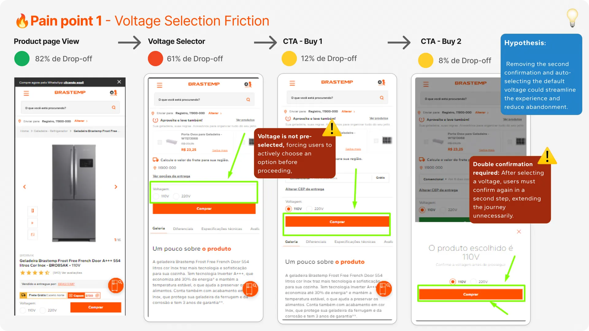
- Voltage selection frictionNo default voltage, plus a redundant second confirmation, stretched the path to buy. The move: pre-select a default and keep the CTA always visible.
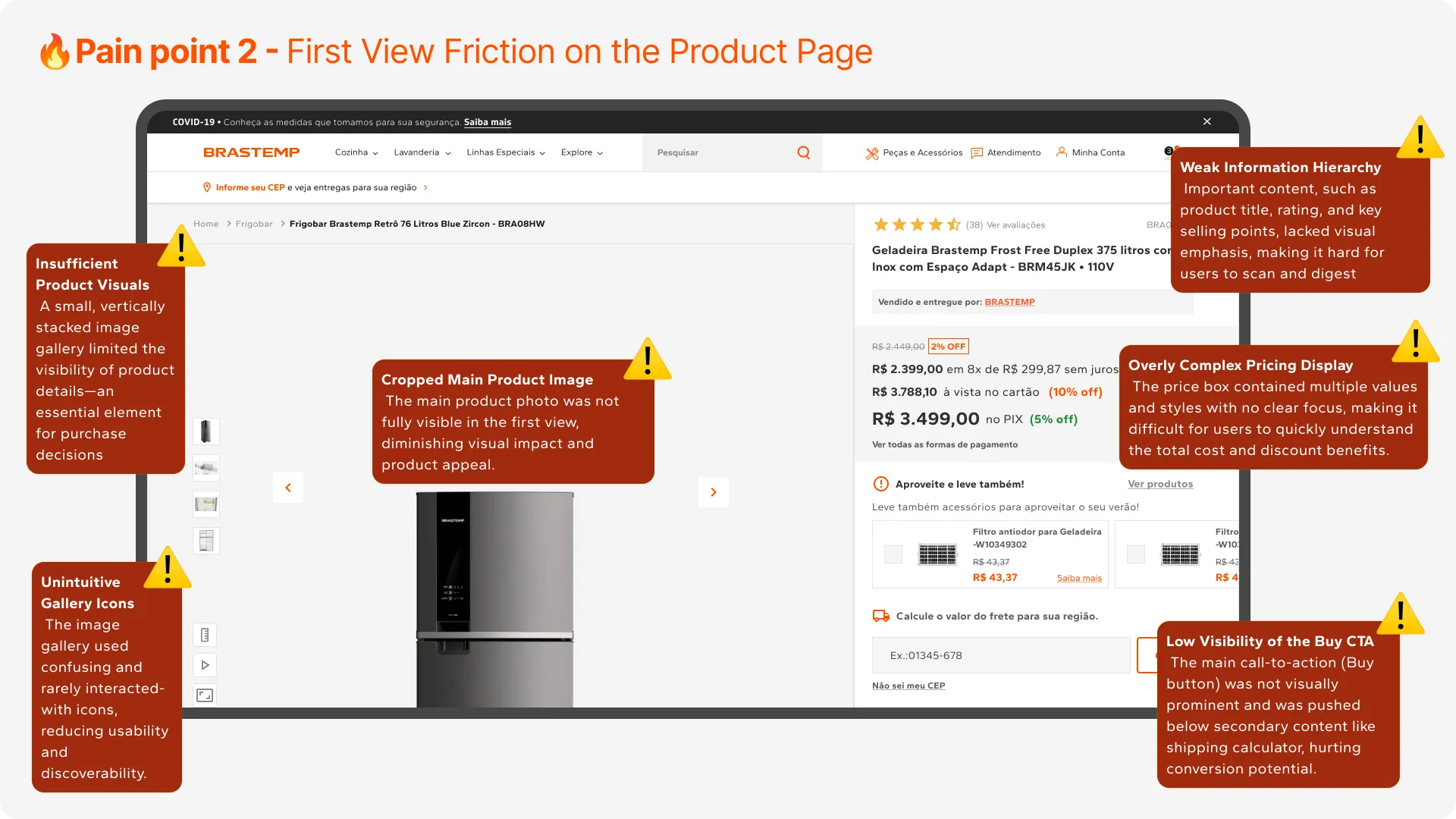
- First-view frictionKey information and trust signals sat below the fold, weakening the first impression. The move: rebuild the fold around the decision.
- Complex product featuresDetails were hard to scan, leading to cognitive overload. The move: make features absorbable at a glance.
- Weak social proofReviews were buried, despite driving conversion. The move: bring reviews up to meet intent.
- Checkout payment frictionPix mattered to cash flow but leaked between intent and completion. The move: a mobile-first Pix flow with a WhatsApp nudge.
1. Voltage selection, streamlined
The voltage step was quietly bleeding users. Two problems compounded:
- No default was pre-selected, forcing every buyer to actively pick a voltage before they could proceed.
- A second confirmation made them re-confirm that choice in a separate step, stretching the journey for no reason.
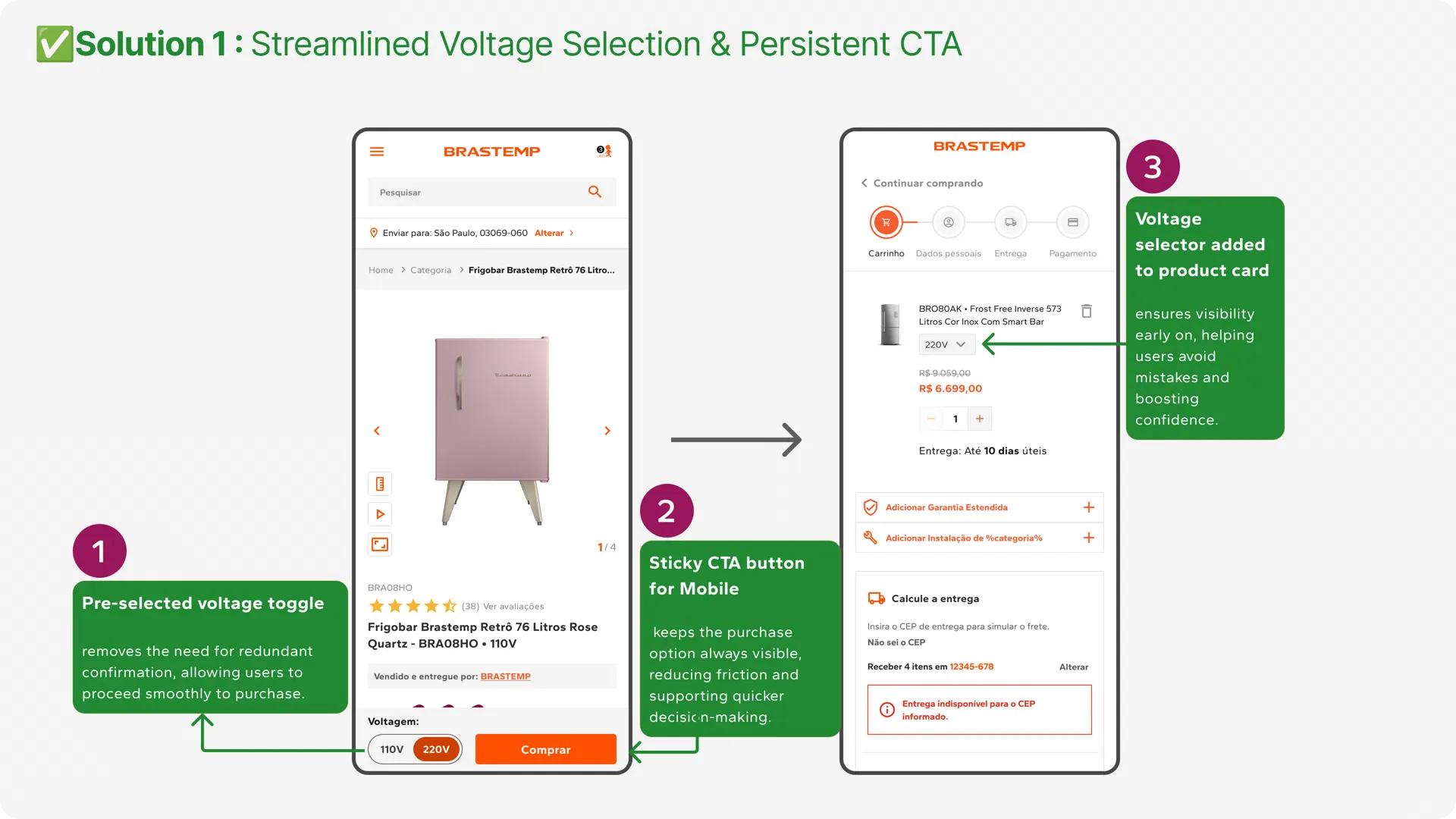
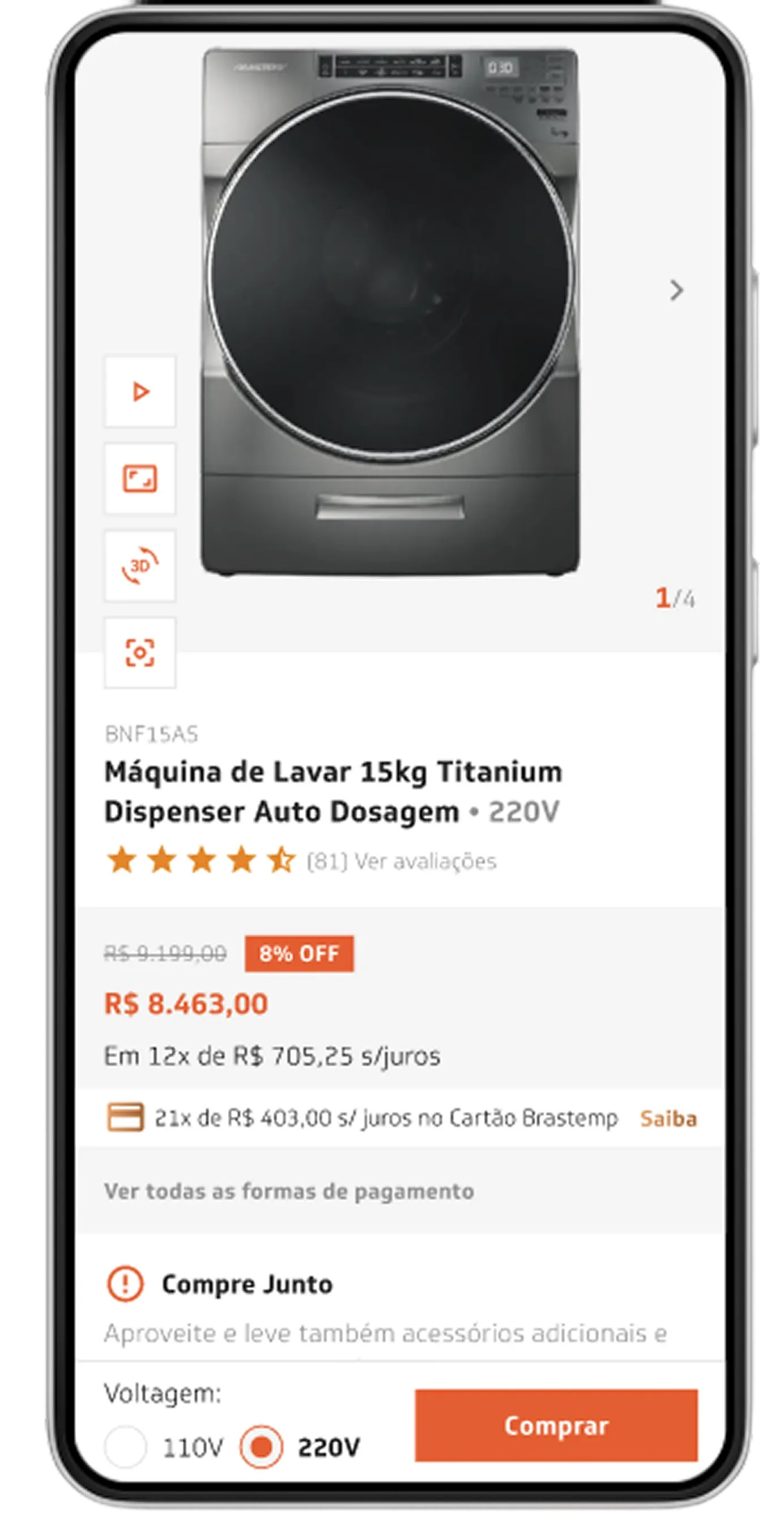
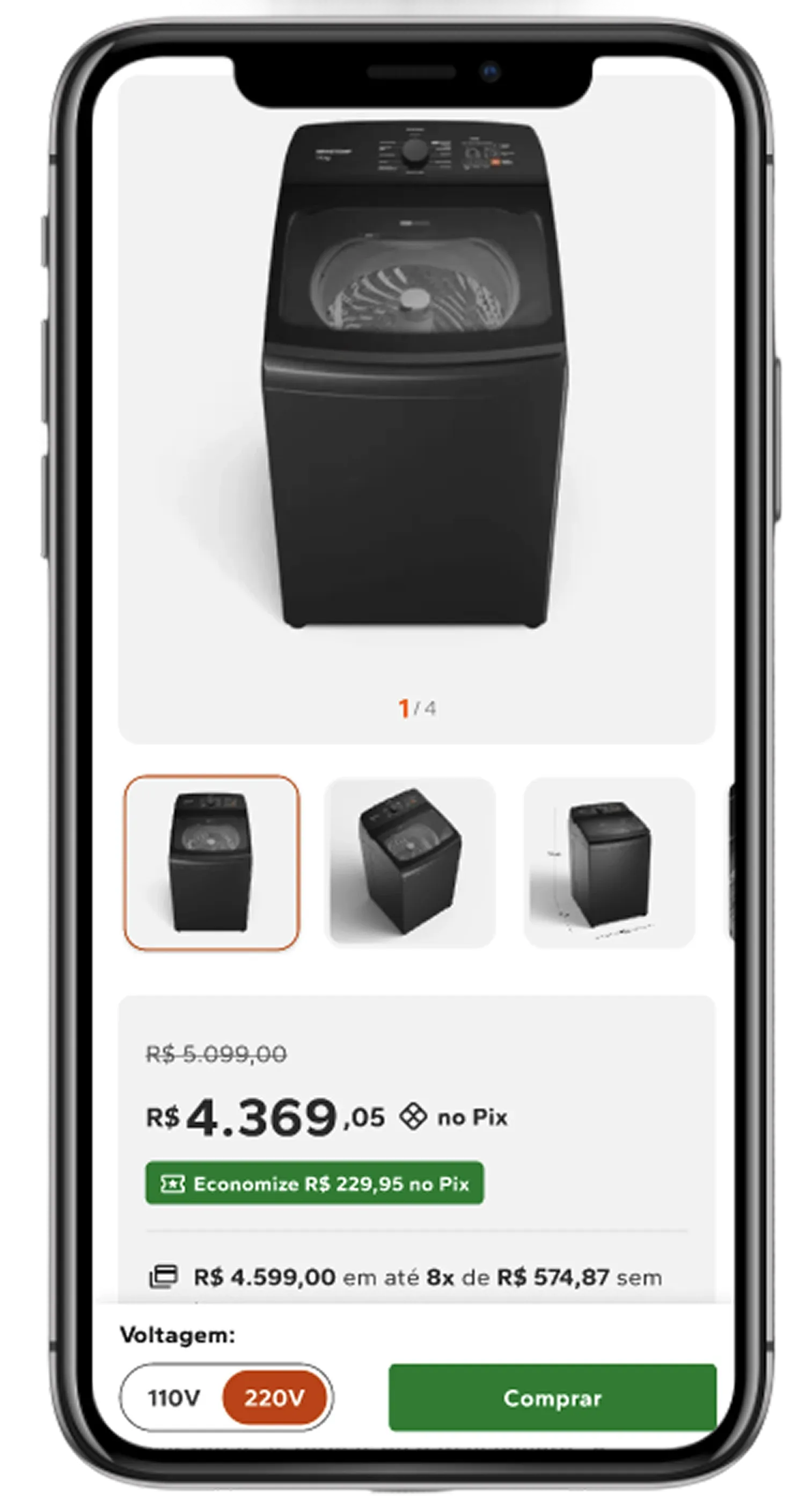
I pre-selected the default voltage to remove the redundant confirmation, surfaced the selector earlier, right on the product card, and made the Buy CTA persistent on mobile so the purchase action never scrolls out of reach.
2. A first view rebuilt around the decision
The original first view worked against the buyer: a cropped main image, weak hierarchy, a pricing box crowded with competing values, and a Buy CTA pushed below secondary content. I reorganized it around what actually drives the decision:
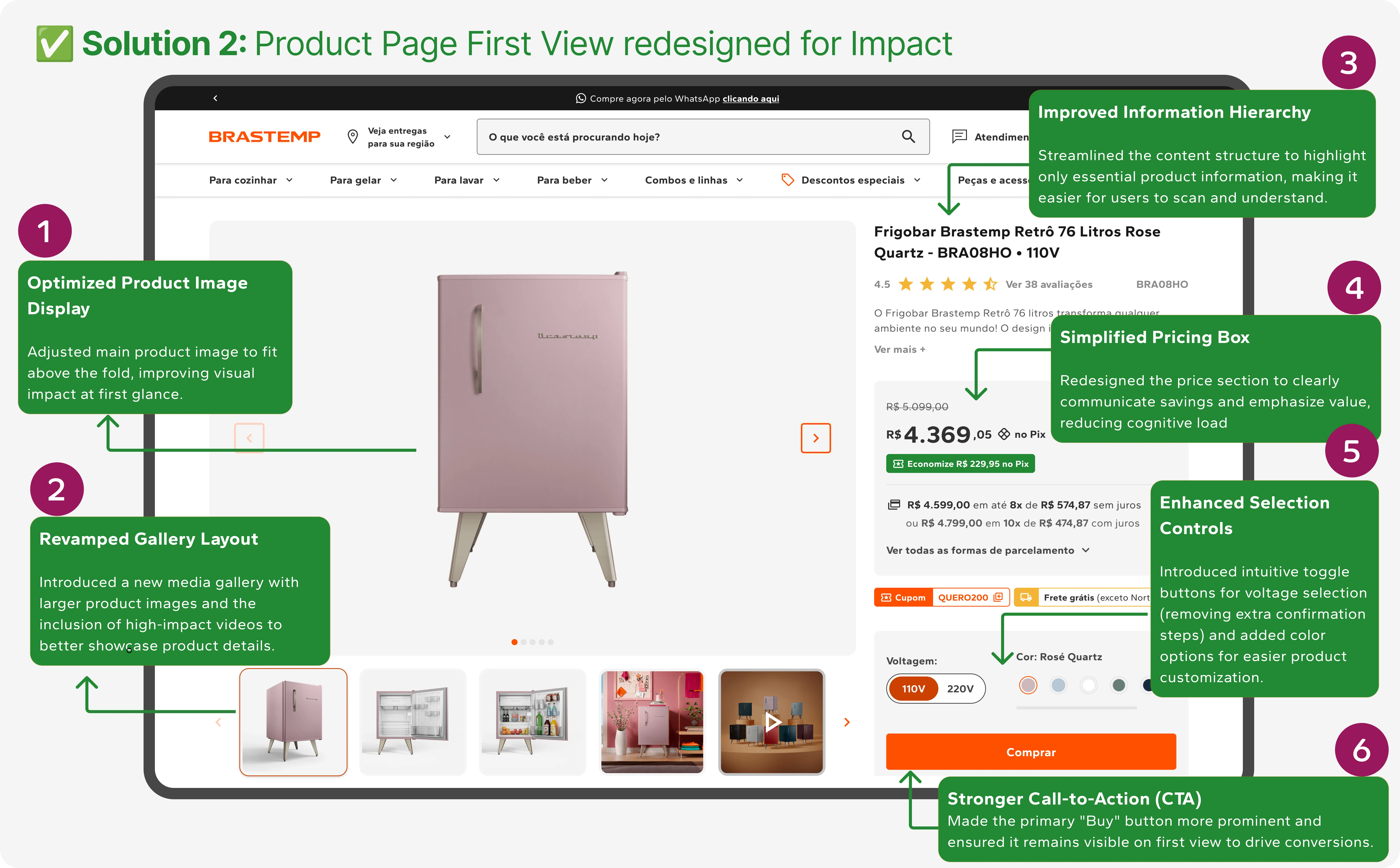
- An optimized product image above the fold, with a revamped gallery of larger images and video.
- A simplified pricing box that makes the savings legible at a glance.
- Clearer selection controls and a prominent, always-visible CTA.
A/B test results · Mobile + Desktop
3. Product Features redesigned
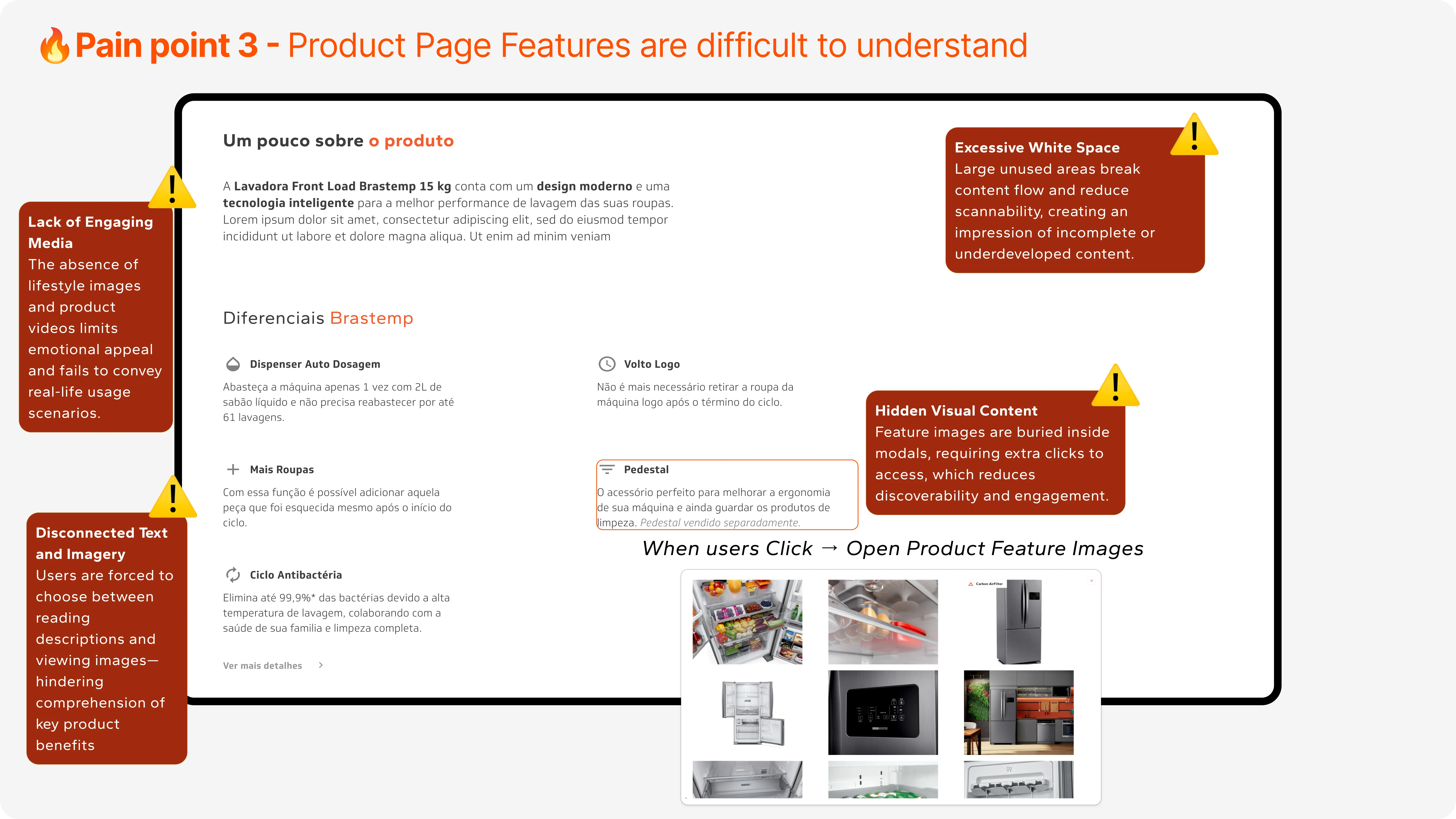
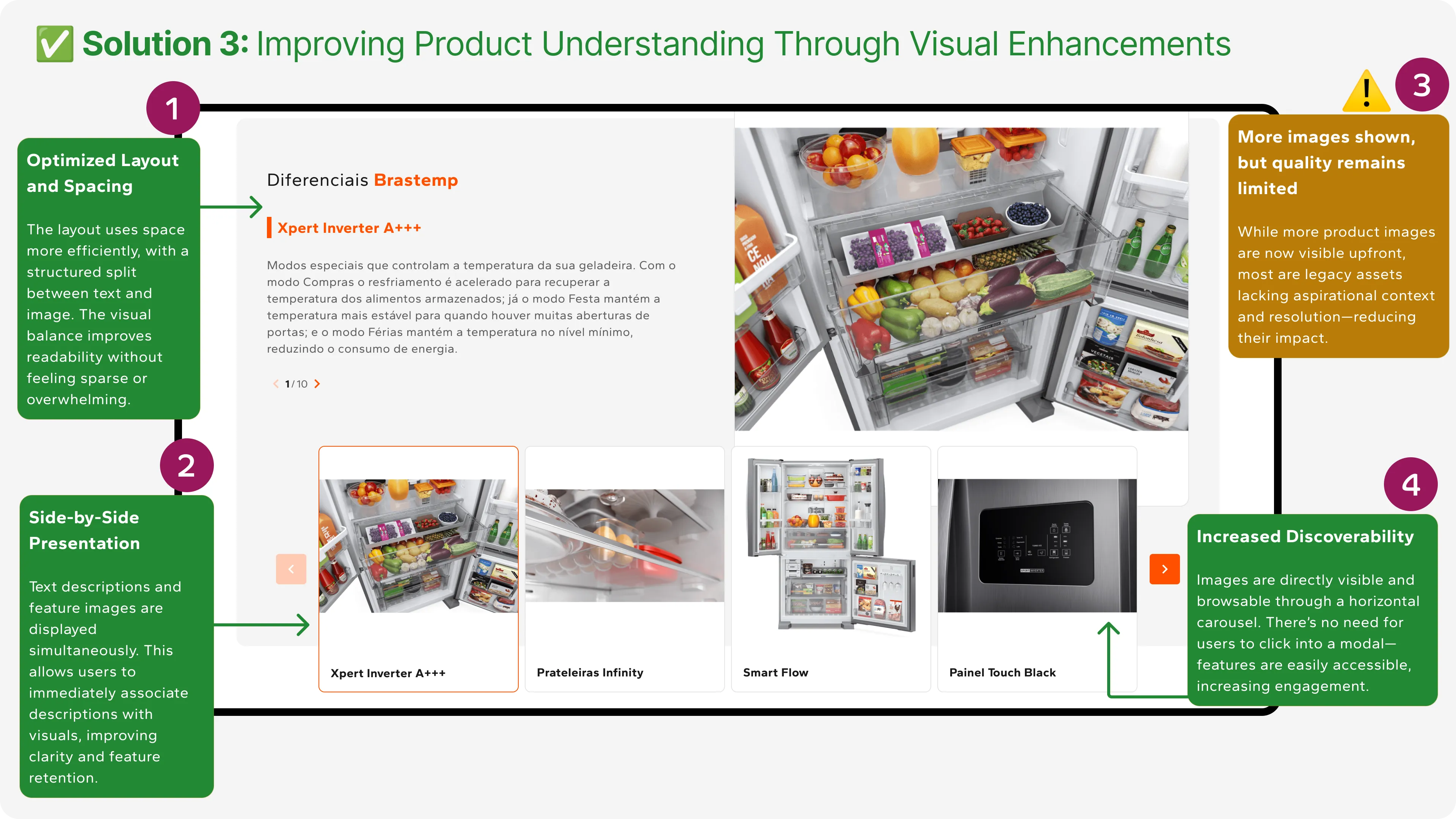
Feature content was buried inside modals, forcing people to choose between reading a description and seeing the product. I moved it into a side-by-side, horizontally browsable layout so copy and imagery are absorbed together.
Being honest about this one, two things are worth calling out:
- The business result held; the interaction hypothesis only partly did. I shipped a carousel over a vertical list, betting the vertical version would make mobile (~80% of sessions) punishingly long. Conversion and add-to-cart both rose, but engagement with the carousel itself came in lower than expected, a real signal for the next iteration.
- A second limit sat upstream of design. Many legacy product images lacked the resolution and aspirational context to carry the new modules, which capped the ceiling on this work.
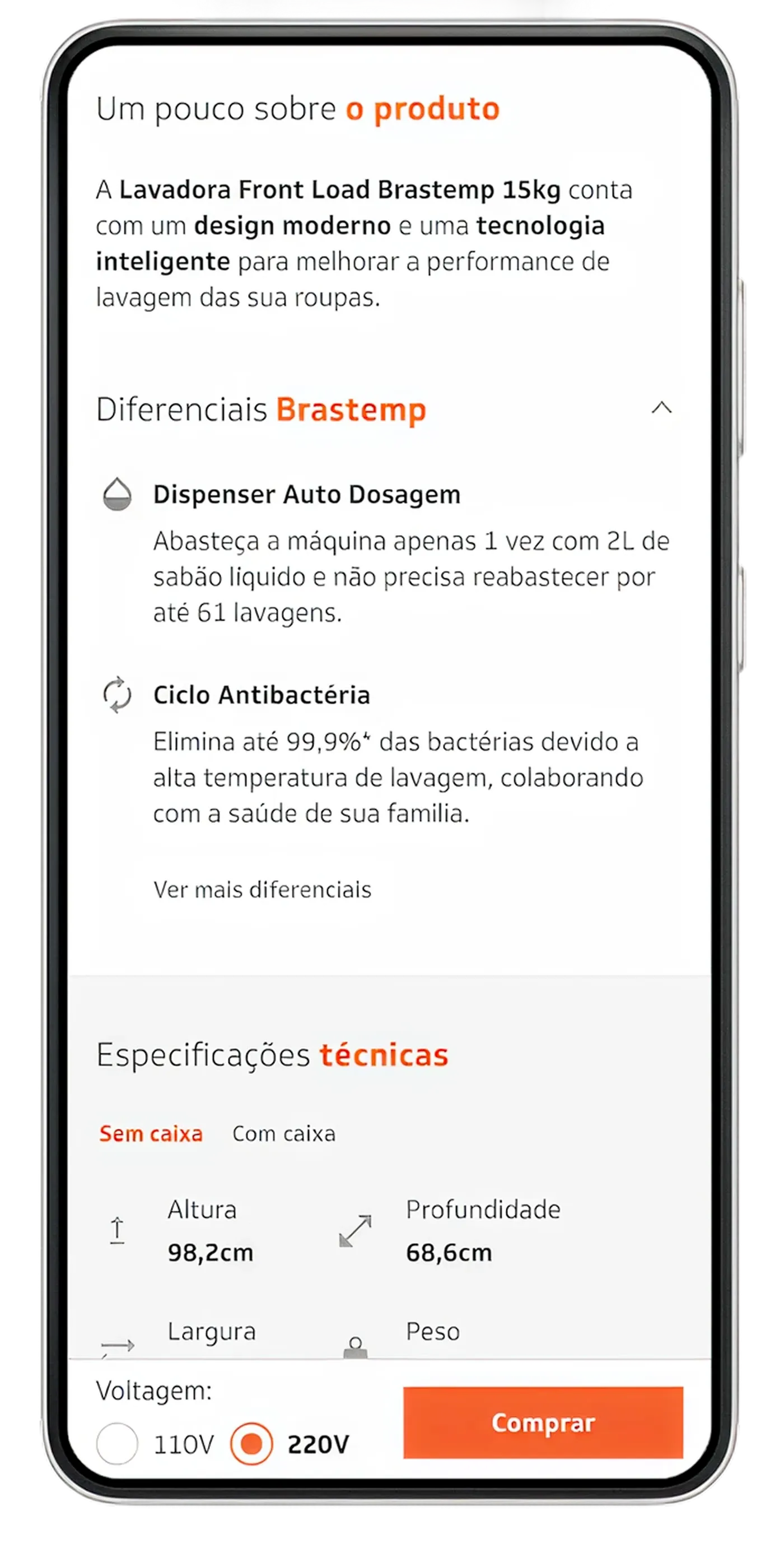
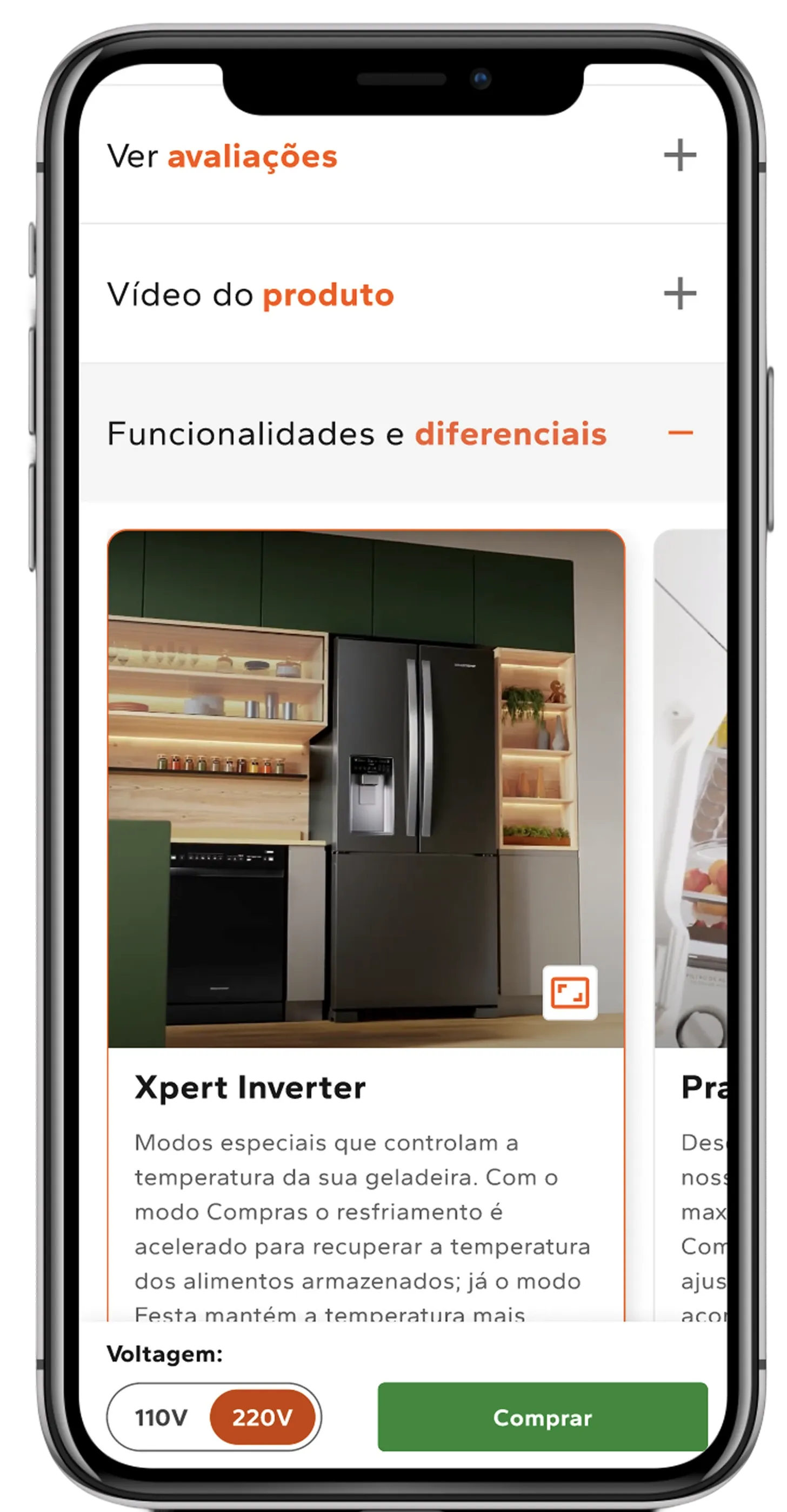
A/B test results · Mobile + Desktop
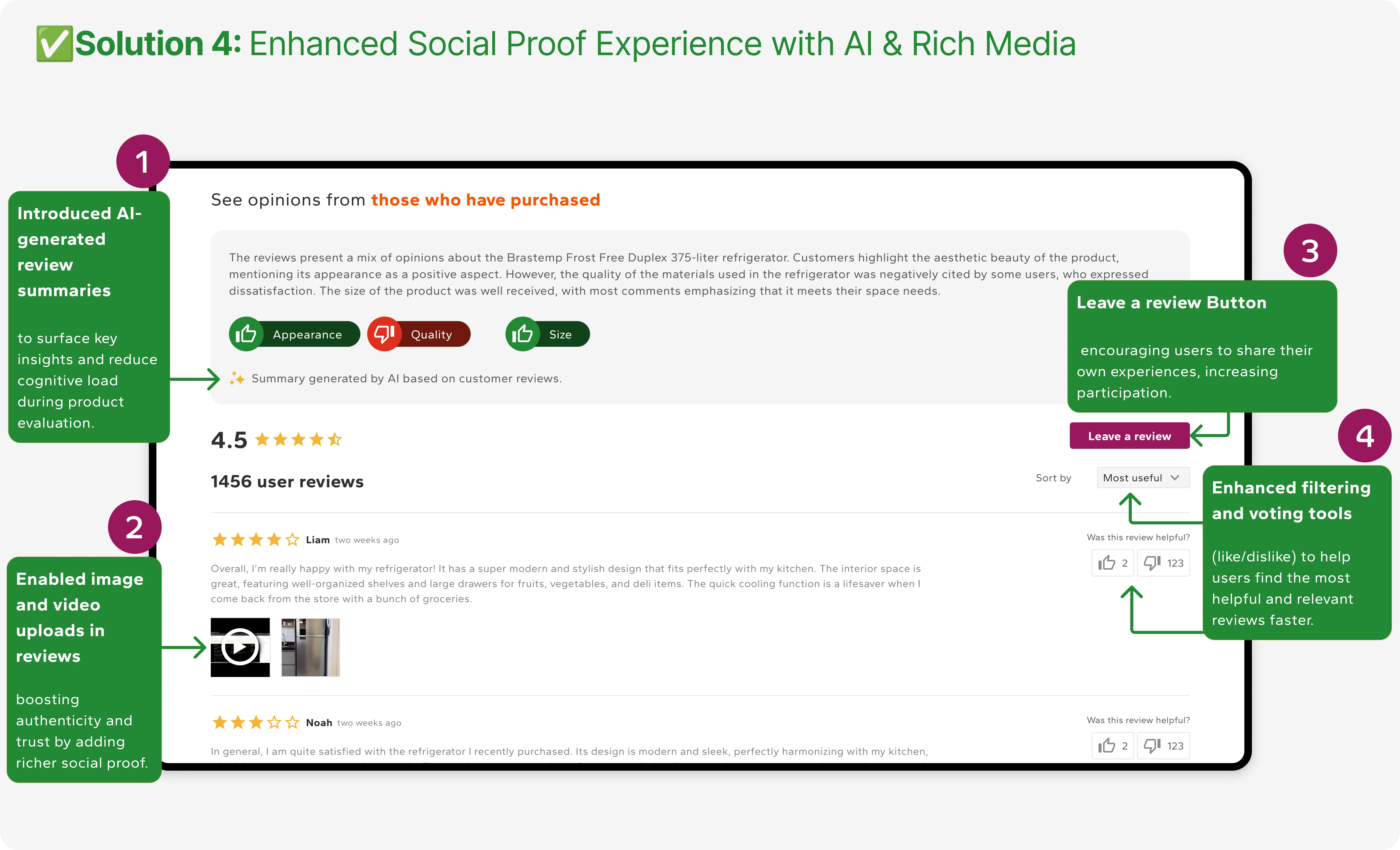
4. Reviews, redesigned but not shipped
The reviews experience was the clearest high-impact opportunity the data pointed to, so I redesigned it fully: voting, filtering, media upload, a responsive layout, and a way to actually write a review, surfaced earlier where the data said it would do the most work. It was designed and validated, then blocked at the finish line by an organizational dependency, decommissioning the legacy review tool and onboarding its replacement. It never deployed. This was the sharpest lesson of the project, and it's the reason my first reflection below is about alignment, not craft.
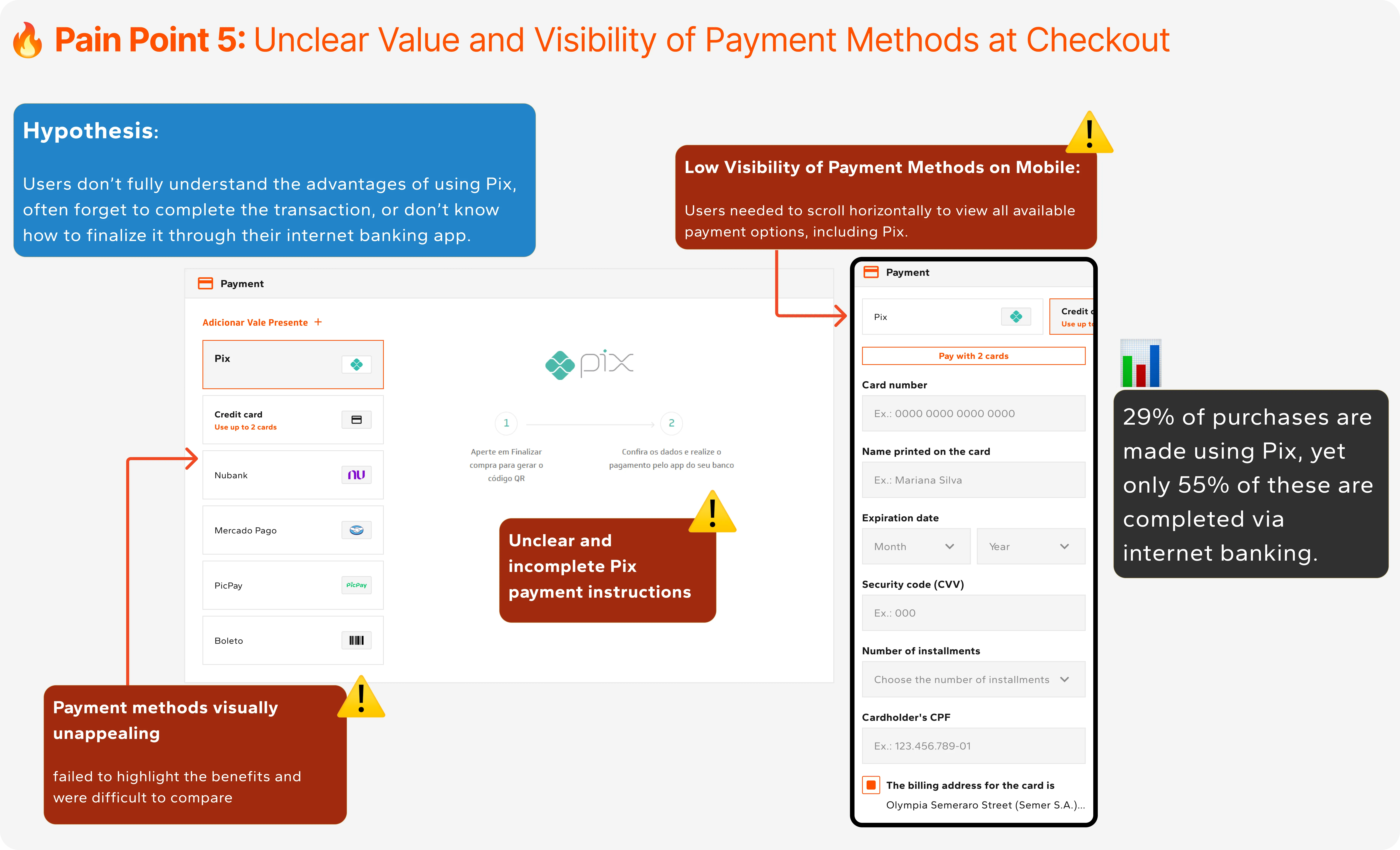
5. A mobile-first checkout, and a Pix nudge
With roughly 85% of users on mobile and Pix strategically important to cash flow (it's paid in full, upfront), the payment step was leaking intent: people chose Pix but didn't finish it. I redesigned the step around four moves:
- Prioritized Pix visually so it reads as the recommended path.
- Total cost per payment method, making the Pix savings obvious.
- A dedicated Pix screen with step-by-step instructions, QR access, and a live countdown.
- A post-checkout WhatsApp reminder carrying the Pix code, to recover the drop-off between intent and completion.
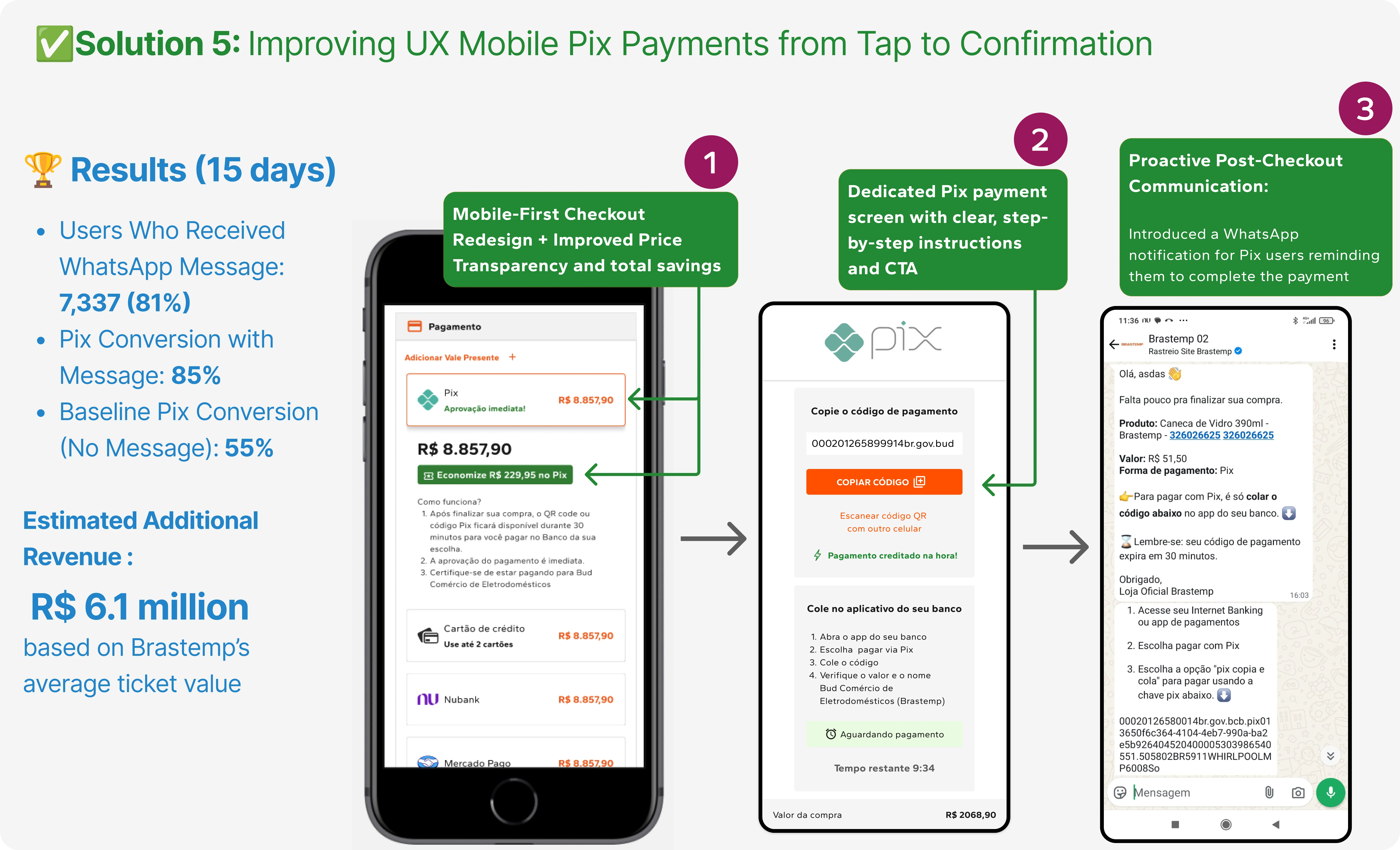
A/B test results · April 29 – May 14
Estimate based on Brastemp's average ticket value of R$2,800.
What the redesign moved
Funnel-level
How it's measured: these are funnel-wide, across the full shopping journey over the period, not attributable to any single change in isolation. The per-experiment lifts below isolate individual modules.
Experience
How it's measured: CES is the Customer Effort Score, a monthly Hotjar survey that collects both qualitative and quantitative responses. Time-on-task is based on an average of Hotjar session recordings and usability tests run afterward, on the task of understanding the product's main features.
Experiment-level · A/B validated
Three things I'd do differently
- Bring cross-team alignment into discovery. The reviews work was designed, validated, and then stranded by an org dependency. On the next project I'd stand up a cross-functional alignment track from discovery, so product, engineering, procurement, and legal are aligned on deprecating legacy tools before design reaches high fidelity.
- Audit content feasibility earlier. Visually driven solutions are only as strong as the assets behind them. A content and asset audit belongs in discovery, not in the middle of execution.
- Advocate for lightweight, early usability testing. Even qualitative testing up front surfaces motivations and mental models that behavioral data alone can't, and it would have de-risked more than one call I had to make on inference.
The real win wasn't any single screen. It was a way of working: let behaviour, not opinion, decide what moves, then hold the line on the user's path even when the org pulls the other way. That's the throughline from a funnel leaking at every step to R$296M in new revenue.