The system that taught the Brastemp brand to speak inside a design system.
Visual foundations and application rules, built single-handedly in 3 weeks, now the foundation for the official Brastemp theme tokens in Orbit.
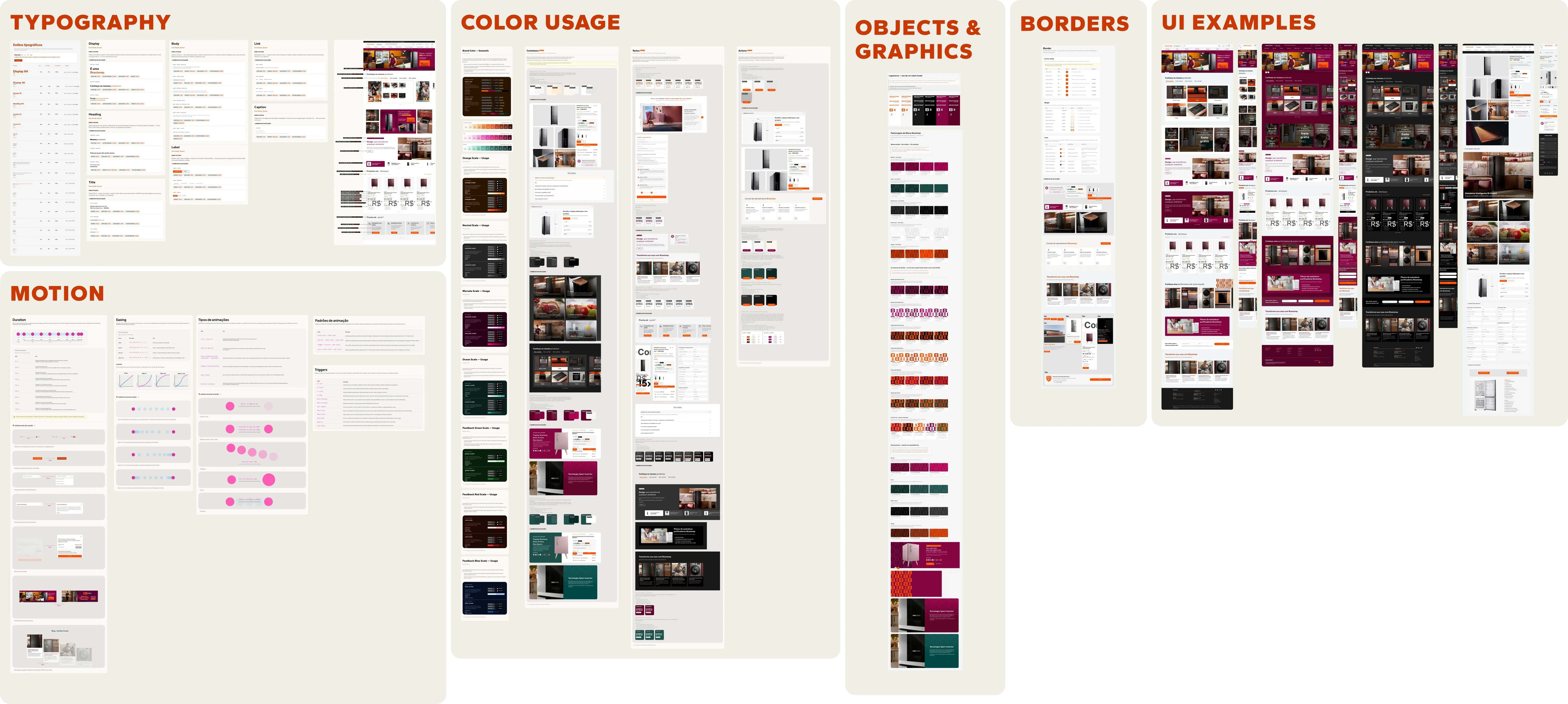
The final deliverable at a glance: one Figma board covering typography, color, borders, motion, objects and graphics, and live UI examples, all consultable in one place.
Case at a glance
- Sole author (mine)
- Design Ops
- Paired PD (validation)
- Whirlpool leadership
Brastemp's primitive and semantic tokens already existed in the new Orbit design system, but with no underlying visual logic or rules to govern how they should be applied. The atoms existed. The grammar was missing.
Build technical rigor, contrast, and traceability into a 75-year-old maximalist brand without killing the personality that makes it recognizable, and in a way that still gave other designers room to create rather than locking them in.
- Excavated and reconciled four brandbooks from the 2023 rebrand, extracting what held up in a UI context vs. what was too editorial for product scale
- Audited the legacy Brastemp DS critically: what to carry forward, what needed new formalization
- Wrote application rules grounded in design best practices: contrast ratios, semantic token indirection, radius mapped to component height
- Proposed a three-theme color system (light, dark, marsala) with its own logic per theme for backgrounds, text, CTAs, and graphic pattern
- Derived the branded-moment criterion from that process: a rule the brand never had for when a module should break the neutral base
A complete Style Guide in Figma, not a palette: application rules and real examples that other product designers could consult while building.
- Typography
- Color & ramps
- Surfaces
- Borders
- Motion
- Application rules · DOs and Don'ts
One foundation, three themes (light, marsala, dark), and a branded-moment rule the brand never had before.
The atoms already existed. The grammar was missing.
Brastemp is a 75-year-old brand with a deliberately maximalist visual identity: vibrant orange as its chromatic signature, a tone of voice that moves between "precise" and "spirited," and its own graphic pattern. Orbit, Whirlpool's multi-brand design system, was being built gradually. There was a legacy Brastemp DS that needed to be adapted to the new format.
The primitive and semantic tokens had already been created. But without an underlying visual logic or rule set to give their application meaning. The atoms existed. The grammar was missing.
The challenge wasn't a lack of tokens. It was building technical rigor, contrast, and traceability, without killing the personality that makes the brand recognizable. And doing that in a way that still gave other designers creative room, rather than locking them in.
A living artifact: direction without constraints.
Before the old Brastemp DS could be officially migrated to Orbit's new brand-agnostic format, someone had to define how the brand's tokens should be applied: enough direction to keep the brand coherent, without over-restricting what other designers could create. My role was to go through every token and propose a Figma deliverable that product designers could consult while building.
Typography
Complete scale in Gantari, from Display to Caption, with weight and purpose defined by context of use.
Color
7 primitive scales (Orange, Marsala, Ocean, Neutral plus 3 feedback) and the brand semantic layer.
Border
Corner radius, weight, and color, mapped by component height and function, not visual preference.
Motion
Duration, easing, animation types, and composite patterns. Movement as functional language.
Actions / Text / Containers
Which color to use, on which background, with which contrast. A contextual decision system, not a loose palette.
Branded Moments
The criterion, previously nonexistent, for knowing when a module should break the neutral base of the site.
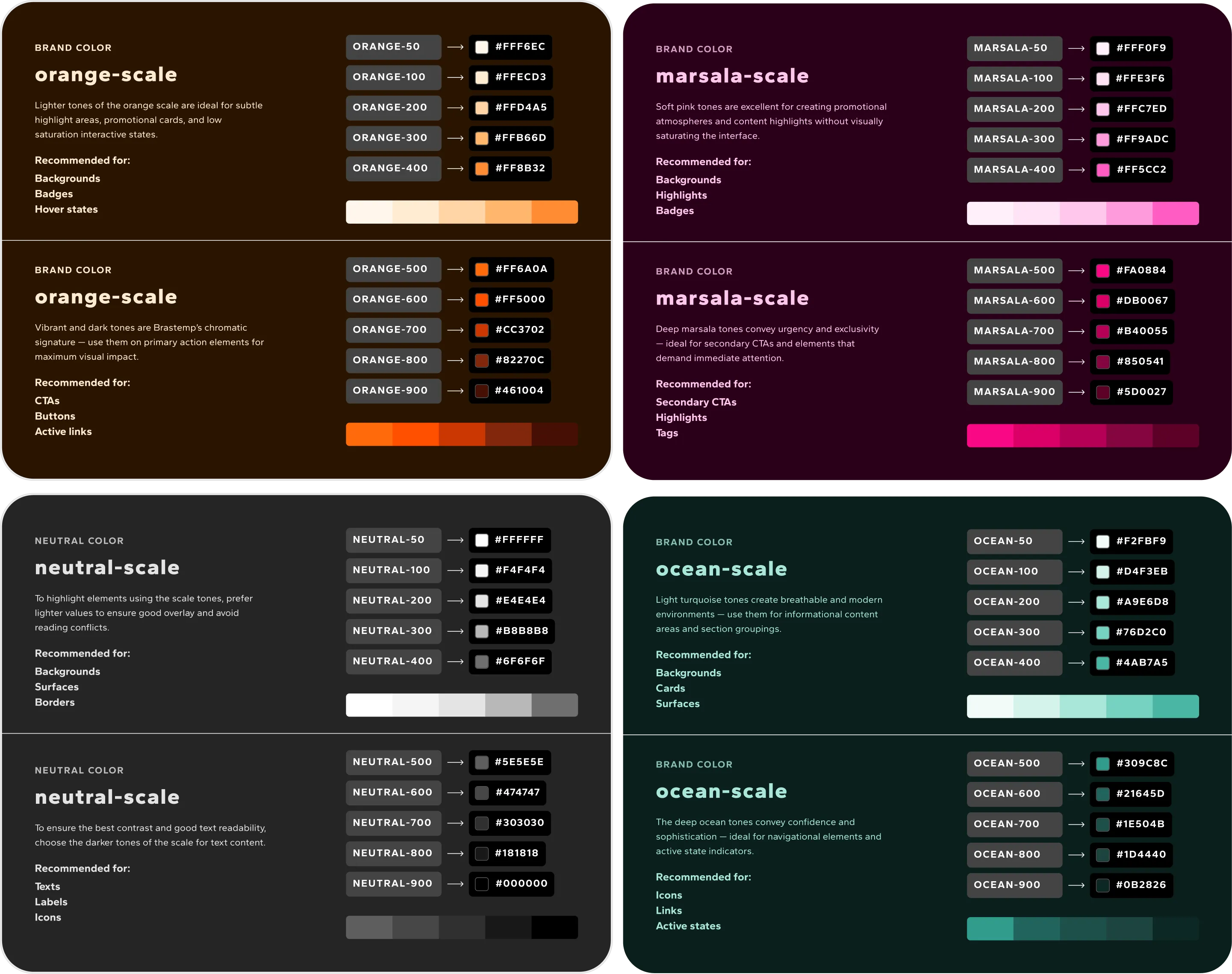
4 primitive scales with 10 tones each, mapped by function of use. The semantic layer abstracts these values so components never reference hexadecimals directly.
Anyone can document a palette. What matters is the criterion behind it.
The old Brastemp DS had been modernized and expanded for Orbit, so its previous criteria no longer fully applied. The color ramps in particular left us quite constrained. My real challenge was translating that broadened system into clear examples and rules the other product designers could actually follow.
I had no leadership oversight and, at times, conflicting directions on what to propose: document what already exists (as is), or document what should exist (to be). With time against us, I made the calls myself and justified the rationale to the whole team during delivery. The four decisions below show how, because each one meant resolving an ambiguity without anyone deciding for me.
The AS IS vs. IDEAL tension, resolved without escalating
During execution, I received conflicting instructions from Design Ops leadership: one side wanted to document strictly what already exists in production. The other defended documenting what should exist, ideal proposals, even without implementation.
These two instructions can't coexist without someone deciding, case by case, which one applies. I didn't escalate the decision. I developed my own criterion: replicate what was already solved, propose new formalization only where there was a real gap.
No one told me how to resolve this conflict. I documented what was right to replicate, and proposed what was missing, justifying each choice in writing, case by case.
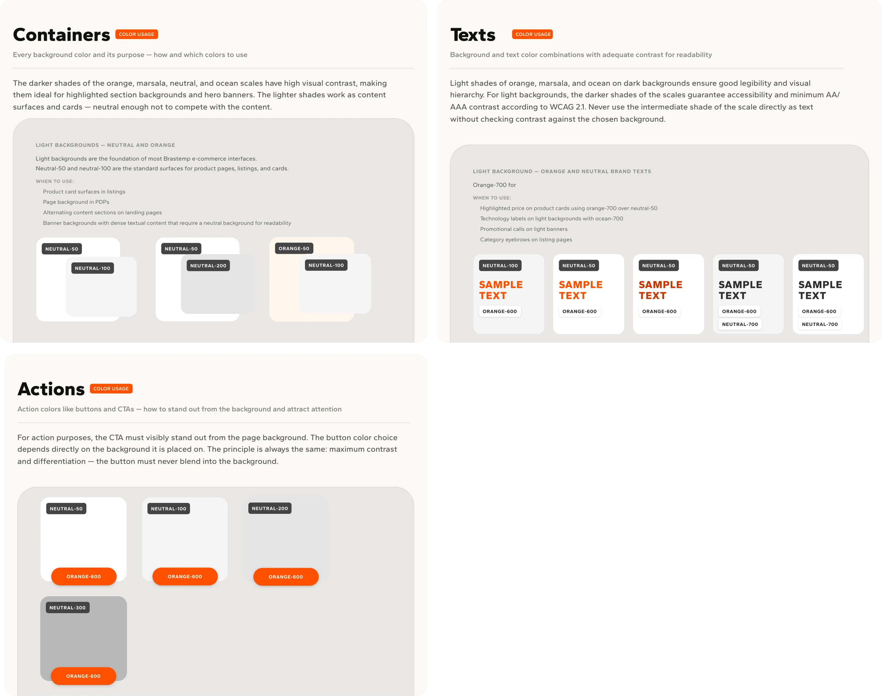
Cross-application rules: which background color requires which CTA, which background/text combinations guarantee AA/AAA contrast. The decision system any designer can apply without having to ask.
The pragmatic tradeoff: Gantari instead of Haboro Contrast
The brand guidelines defined a typographic pair: Haboro Contrast for impact plus Gantari for UI. But Haboro Contrast is a paid font (Adobe Fonts) and was never actually used on the site, only in institutional marketing pieces.
Decision: drop Haboro Contrast entirely. Use only Gantari (Google Fonts, free) across the full scale, supplying the expressive role of the pair through the contrast between Bold (precise) and Regular Italic (spirited) within the same family.
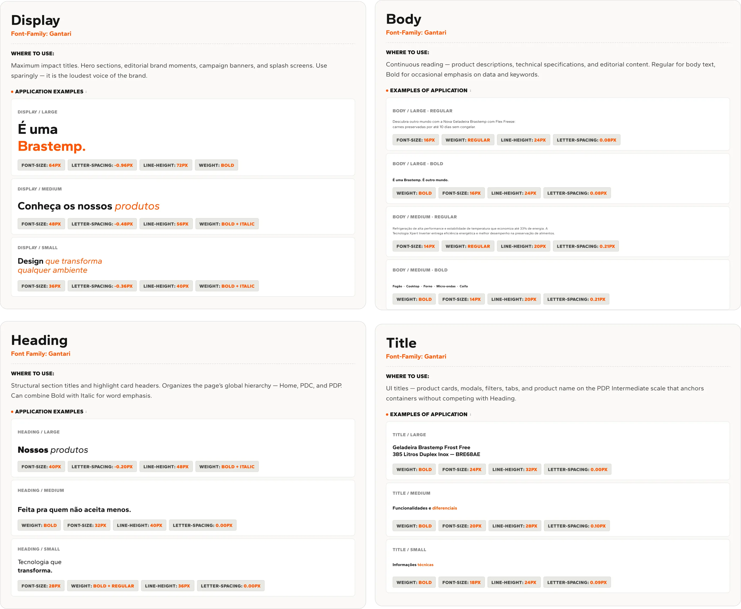
Complete scale in Gantari: Display Bold for impact, Bold Italic for expressiveness. The typographic pair that replaced Haboro Contrast without losing the contrast between "precise" and "spirited."
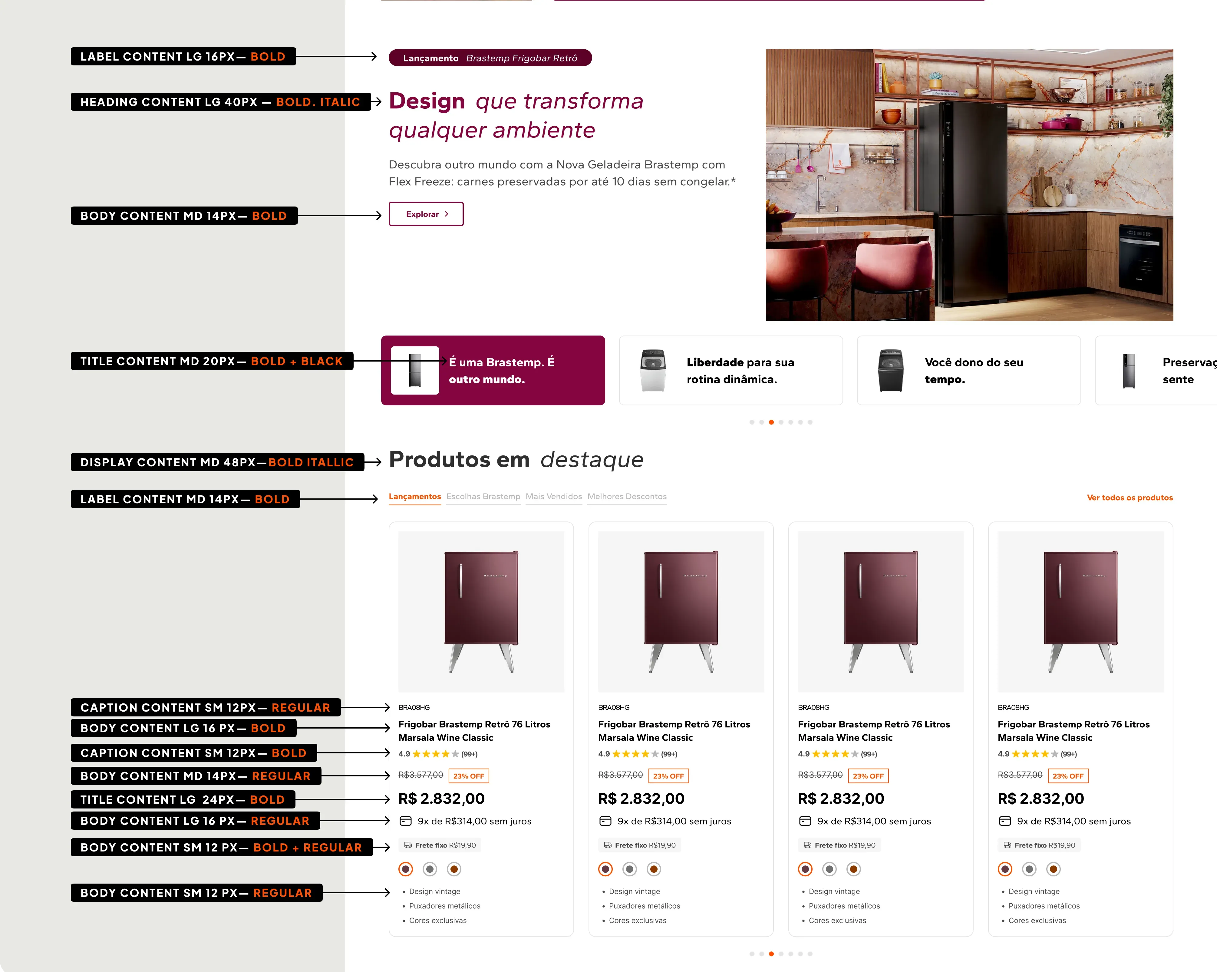
The scale in context: each level annotated on a real page, so every size and weight maps to a role, from Display and Heading down to Title, Body, Label, and Caption.
This isn't a passively accepted limitation. It's a decision about licensing cost at scale, prioritizing what's in real production over what looks good in a brand deck.
The grammar of Pattern B: rules with rationale, not caprice
The brand's "B" graphic pattern was systematized into 3 categories of use, each with its own contrast logic, including an explicit directional rule:
"Orange over Marsala is the logic of the 'É outro mundo' campaign. It must not be reversed. Marsala as pattern over an Orange background loses definition."
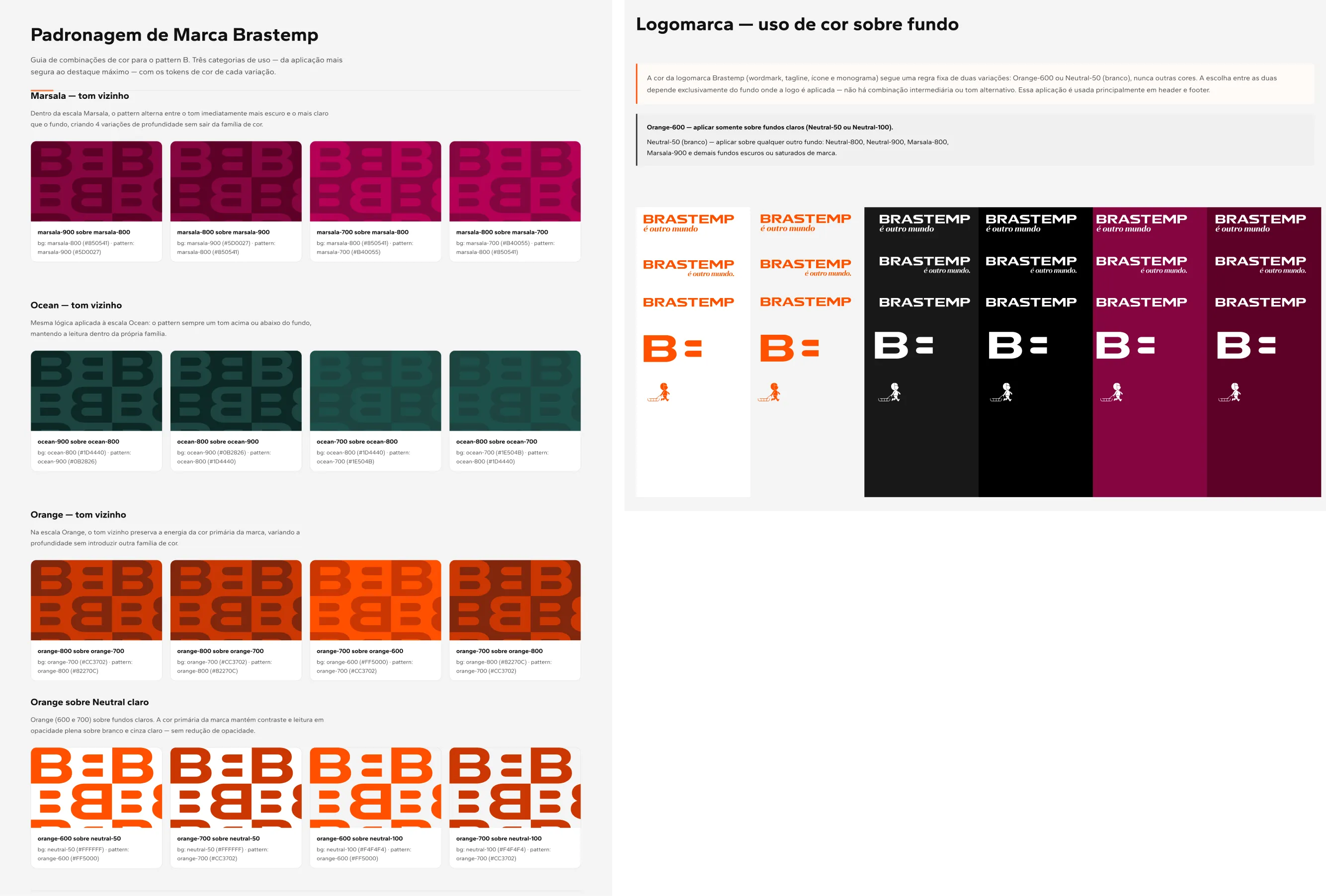
Three categories of pattern use: neighboring tone (subtle texture), cross-family (surface accent), and white overlay at 10% (universal finish). Alongside, the binary logo rule: Orange-600 over light backgrounds, Neutral-50 over any other background.
Motion as functional language, not decoration
Each duration value (50ms to 1100ms) is mapped by function, not aesthetic preference: 50ms for instant checkbox feedback, 1100ms for large-scale illustrative hero animations. Composite patterns, stagger plus position plus fade for cascading cards, scale plus slide plus fade for critical modals, ensure that movement communicates hierarchy.
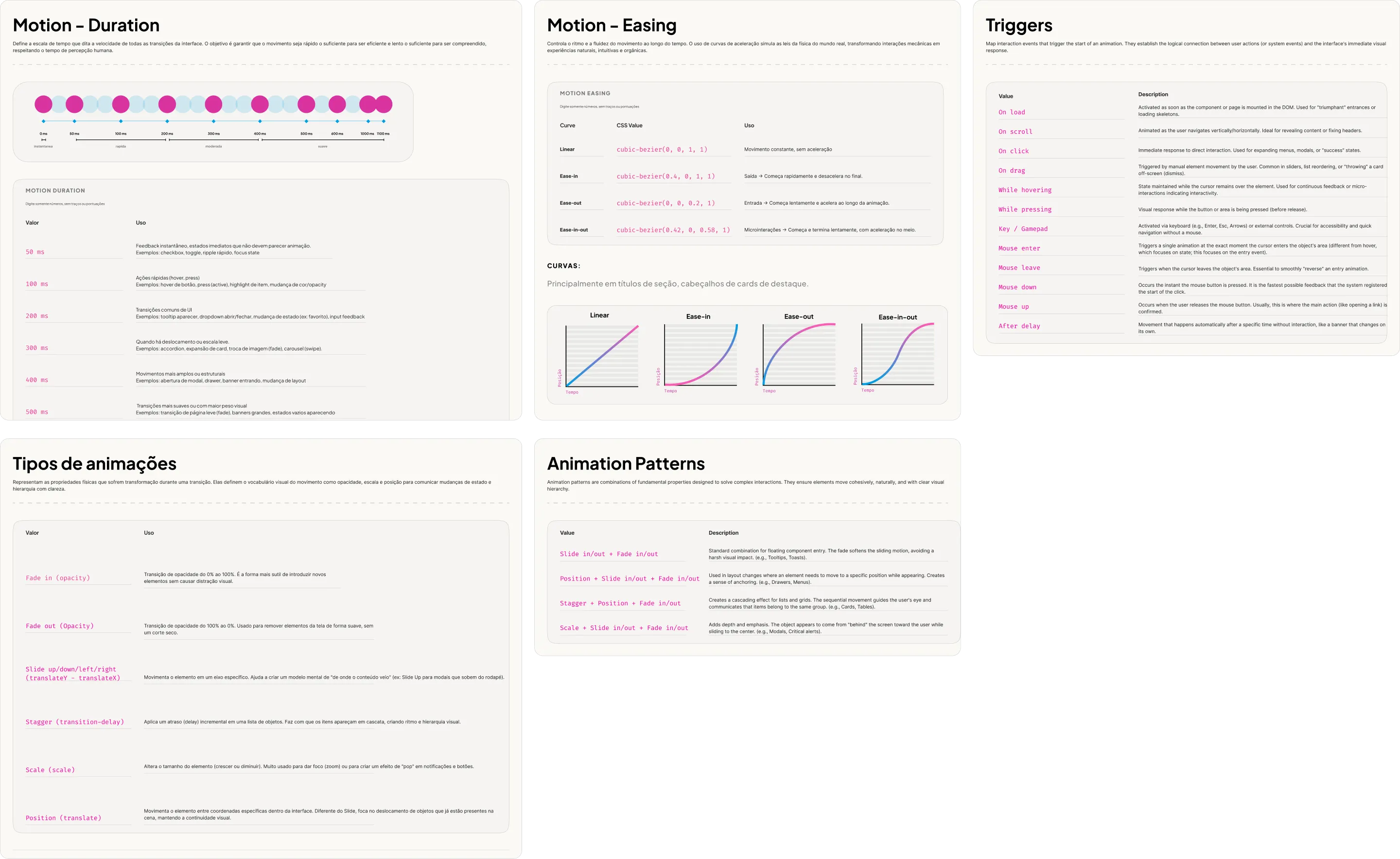
Complete motion system: 8 duration values mapped by function, 4 easing curves with usage rationale, and composite patterns that guarantee visual hierarchy through movement.
Branded Moments: why this entire block turned Marsala right now.
This section isn't in Marsala by accident. It is the rule being practiced.
Before this system, there was no answer to a simple question: when do I use Marsala or Ocean as the protagonist of a module, and when don't I? Without a criterion, the decision was left to each designer's judgment, and the brand lost visual discipline exactly when it most needed to stand out.
I brought in the classic visual proportion principle 70/20/10 (a variation of the well-known 60/30/10) and adapted it as a compositional inspiration, not as a fixed implementation rule:
| Proportion | Role | Application |
|---|---|---|
| 70% | Dominant color | Neutral e-commerce base for everyday use |
| 20% | Secondary color | Support blocks, menus, containers |
| 10% | Accent color | Reinterpreted as an entire module, not a detail |
When the 10% module appears as a complete block, with its own graphic pattern, it becomes the branded moment: the deliberate visual break that signals "this is the brand speaking at full volume."
This was my proposal, brought from outside and translated into the specific vocabulary of the brand. Leadership didn't participate in the resolution, but approved the result with explicit praise, especially highlighting the delivery in 3 weeks.
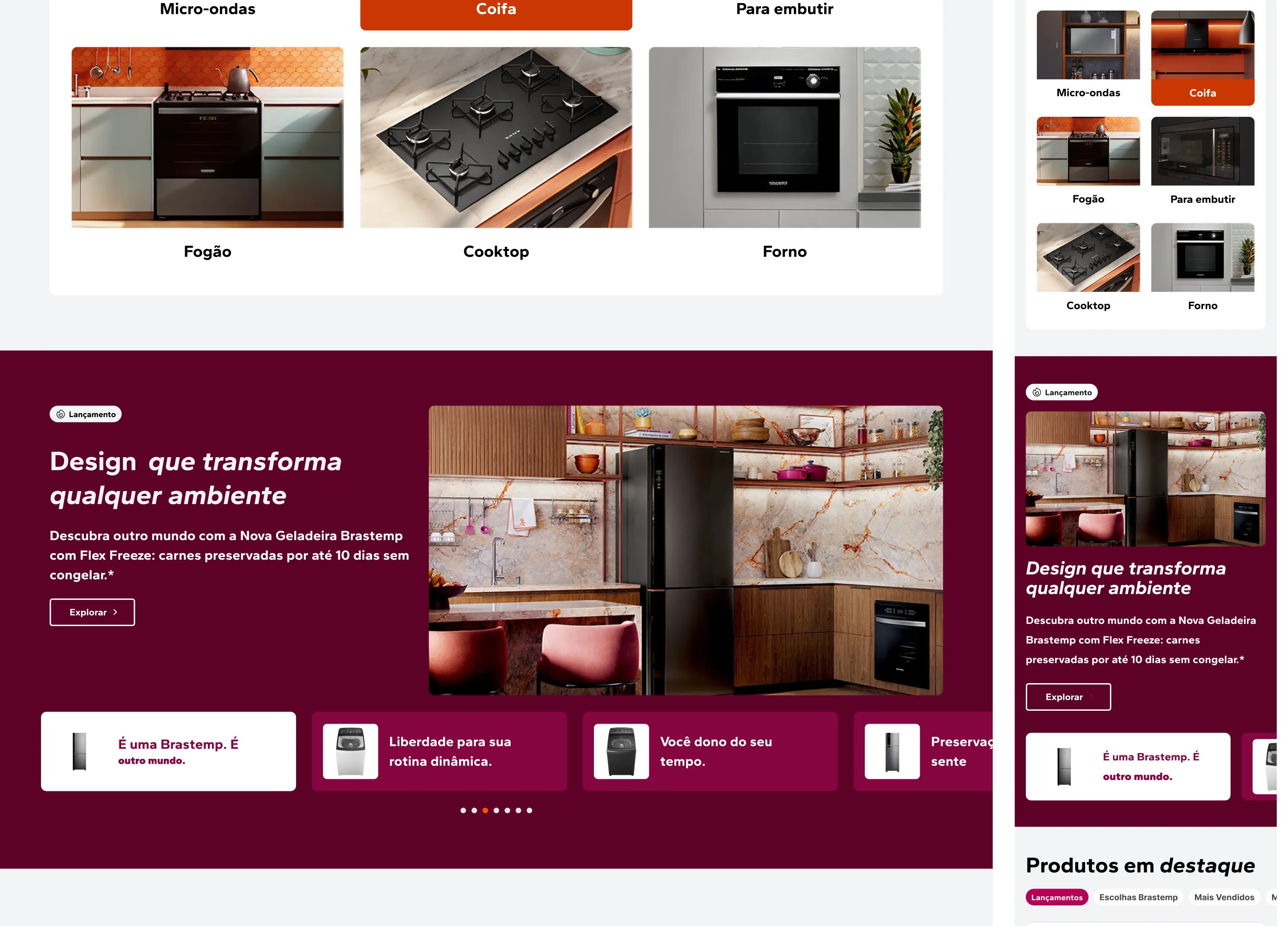
The branded moment in action: neutral background as the base, a complete module in Marsala-800 with Pattern B as a deliberate visual break. The 70/20/10 rule translated into a real page.
Proof that the system works outside my own head.
To validate that the system was robust, and not just personal style, I paired with another Product Designer to prototype the home page in the dark/marsala theme, exploring new color and typography compositions in existing modules.
The entire foundation (tokens, contrast rules, branded moments) is solely my authorship. The collaboration was focused and limited to execution.
This strengthens the case rather than weakening it: it shows the system works without me supervising line by line. That's the real proof of a system, as opposed to one designer's personal style.
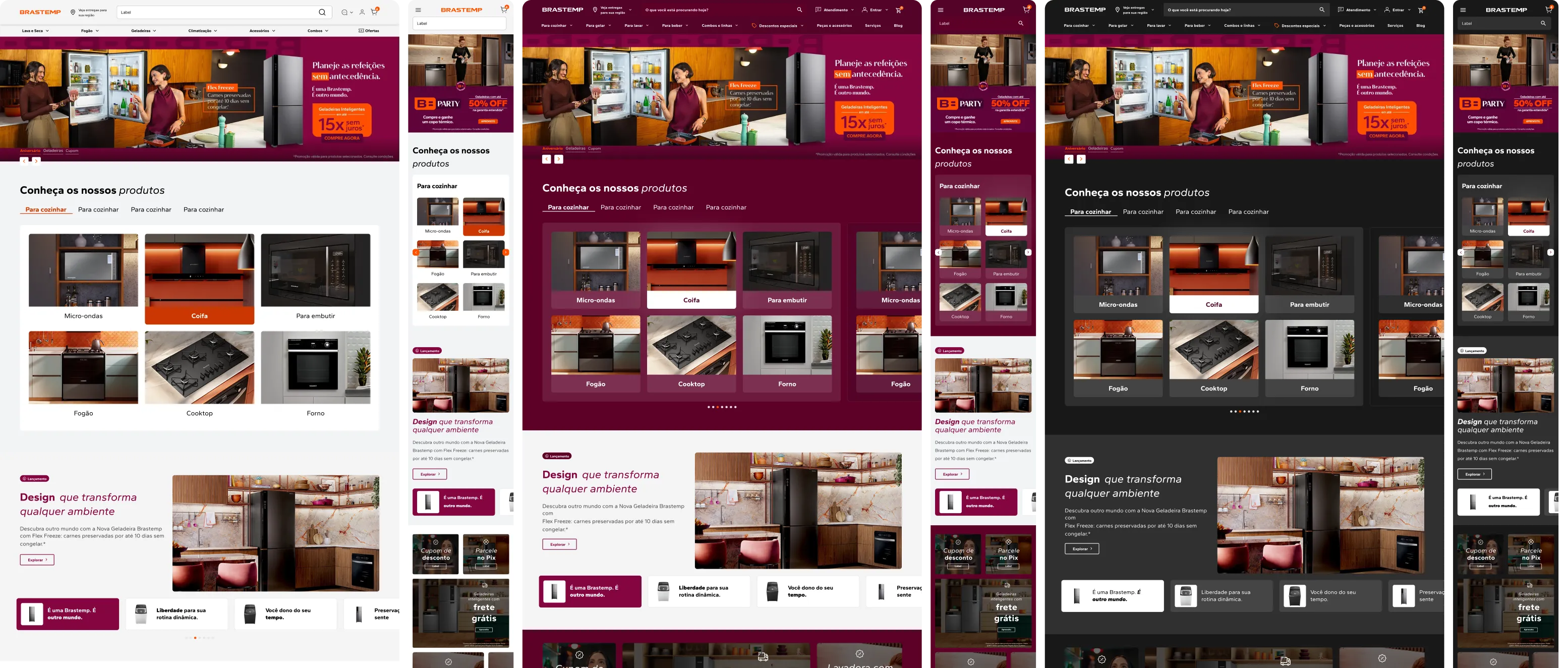
The same system applied across three distinct themes: light (the e-commerce base), marsala (editorial branded moment), and dark (dark neutral background). One foundation, multiple expressions.
From foundations to live pages, across brands and teams.
The real test came when the KV left the guide. Multiple squads applied it to generate the new Home, category, product, and blog pages, componentizing the KV's color, typography, and iconography into interface building blocks, structured in Figma to mirror VTEX's component architecture. Whirlpool, Consul, and Brastemp now share the same structural foundation, while the tokens keep each brand's color, type, and spacing unmistakably its own.
My role at this stage was direction and quality: I conducted Design Critique sessions with the teams applying the KV and reviewed every page against the foundations, so each exception was either corrected or written back into the rules.
Homepage: the KV unifying existing journeys on desktop and mobile, with video and visual storytelling immersing the user in the brand's ecosystem.
Category page: search journeys aligned to the KV, validating purchase intent with strategic video instead of a static banner.
Product page: a structure already validated across the other brands, with the new visual layer applied so the brand identity and the product stand out.
Blog: the editorial hub in full marsala, the branded-moment rule running in production, built on modular slots so the content team updates it without engineering.
Scoped on purpose, not left by oversight.
Three weeks meant some work was deliberately deferred and handed off as next steps. Each one was named before delivery, with a clear reason to exist:
- Verbal universe and tone of voice, so the brand sounds as consistent as it looks.
- Opacity, shadows/elevation, and glows for dark mode, to give the dark theme real depth and hierarchy.
- Color and effect applications for the premium product line (blur, transparency, glow), to give premium products a distinct, elevated treatment.
I knew exactly what was out of scope, and why, before delivering. These weren't gaps discovered afterward, they were planned next steps.
Why a foundation like this matters.
This was my first time building a formal system at this depth, and it reframed what I think a brand foundation is actually for: scale, governance, and consistency.
- A foundation is what lets a brand scale. A token is just a value (
orange-600 = #FF5000). The logic for applying it, the examples, and the DOs and Don'ts are what let many designers ship consistent work in parallel, in any product, without stopping to ask. - Documentation is governance. Writing the criterion down, and showing it in context, turns "how I would do it" into "how the brand does it." Decisions stop depending on who is in the room and start holding up over time.
- Seeing the whole is part of the deliverable. Laying out typography, color, surfaces, borders, and motion together, with real application examples beside them, is what surfaces the gaps and contradictions a loose list of tokens hides.
- Without a north star, the brand drifts. Left to individual interpretation, everyone applies the brand the way they read it, and over time consistency erodes and the brand pays for it. A foundation is the guardrail that keeps that from happening.
This system is now the foundation for the official Brastemp theme tokens inside Orbit: the first complete brand theme implementation in Whirlpool's multi-brand design system.